至翔NID实景作品|轻启方寸
至翔 NID 空 间 设 计
ZX NID space design
Hard installation design
/
Soft installation design

感谢您关注至翔NID空间设计
Thank you for your attention to ZX NID design
Hard installation design & soft installation design
ZX NID design team
Changshu,Suzhou,China
2024

项目名称 | Name :轻启方寸
项目坐标 | Address :苏州.常熟琴臻雅苑
项目风格 | Style :现代奶油
设计机构 | Design :至翔NID空间设计
施工单位 | Consturuction :至翔精筑
设计时间 | Design time :2023·10
拍摄时间 | Shooting time :2024·09
项目面积 | Area :175㎡
摄影机构 | Photography :AK空间摄影
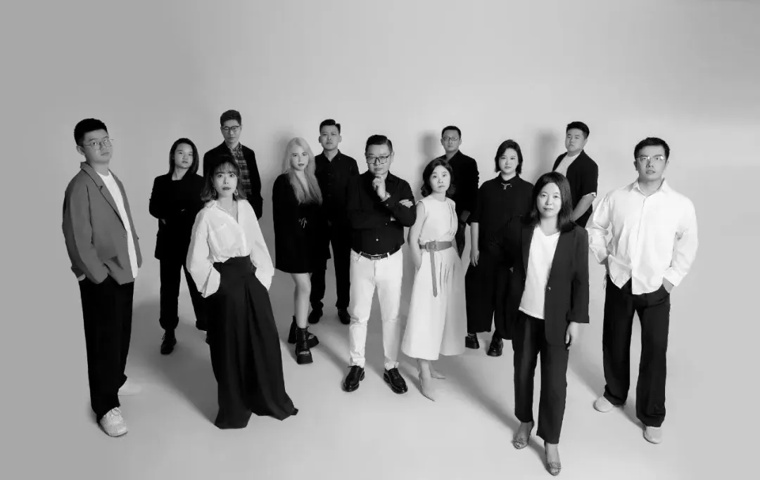
至翔NID空间设计
人的一生,为生活,有计划,
亦步亦趋,有条不紊;
为心灵,不乱方寸,不慕浮华,不随波逐流,
心沉稳,再大的风浪又能奈何。
「 Design & Appeal | 设计&诉求 」
本案的业主是一对退休多年且喜欢全世界旅游的神仙眷侣,夫妻二人深耕建筑设计行业多年,几十年丰富的人生阅历,让他们决定对退休后生活居所做「减法」,加上孩子已在国外工作定居,所以他们选择卖掉了别墅,重新选择大平层公寓作为退休后生活居所。业主希望拥有既明亮温暖又不失高级感的家,为此设计师在设计过程中采用了天然材料:如天然木皮和橡木地板,并特意定制了哑光质感的天然大理石;在软装上选用了能够调节不同角度的梦幻帘和弧形沙发,为室内空间营造出更轻松的氛围。
「 Family changes | 户型改造 」
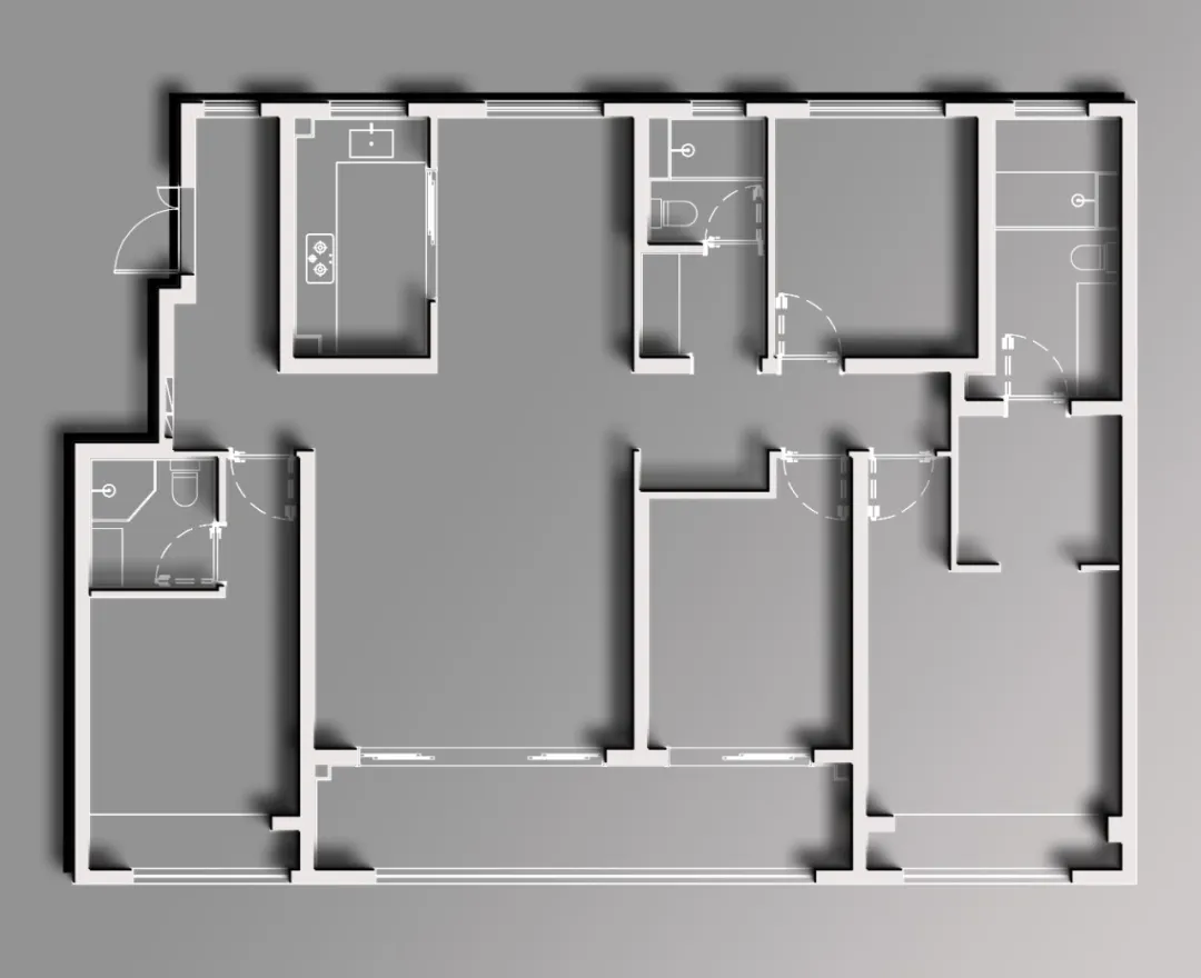
原始结构图
改造点:
1.入户玄关收纳空间不足。
2.客厅阳台有移门分割,没有充足采光+宽阔视野。
3.卧室空间布局不满足业主家庭生活的个性化需求。
4.缺少看书喝茶的场所。
改动:
1.入户玄关走廊尽头增加了储物柜,扩大储物体积。
2.打通阳台空间调整了客厅、书房等公共空间的巡回动线。
3.改变中间南面的房间结构,布置书房功能重塑公区大空间。
4.拆除过道/主卧套房衣帽间墙体,重新归纳储物功能使空间更具合理。
01.
Entrance hall
Design agency: Zhi Xiang NID space design
玄关
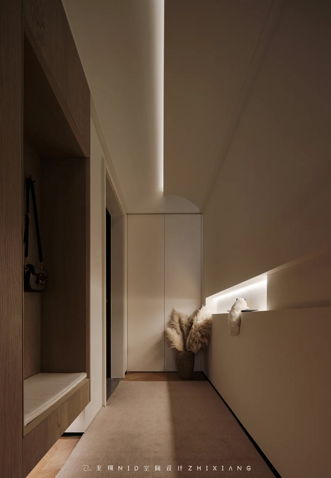
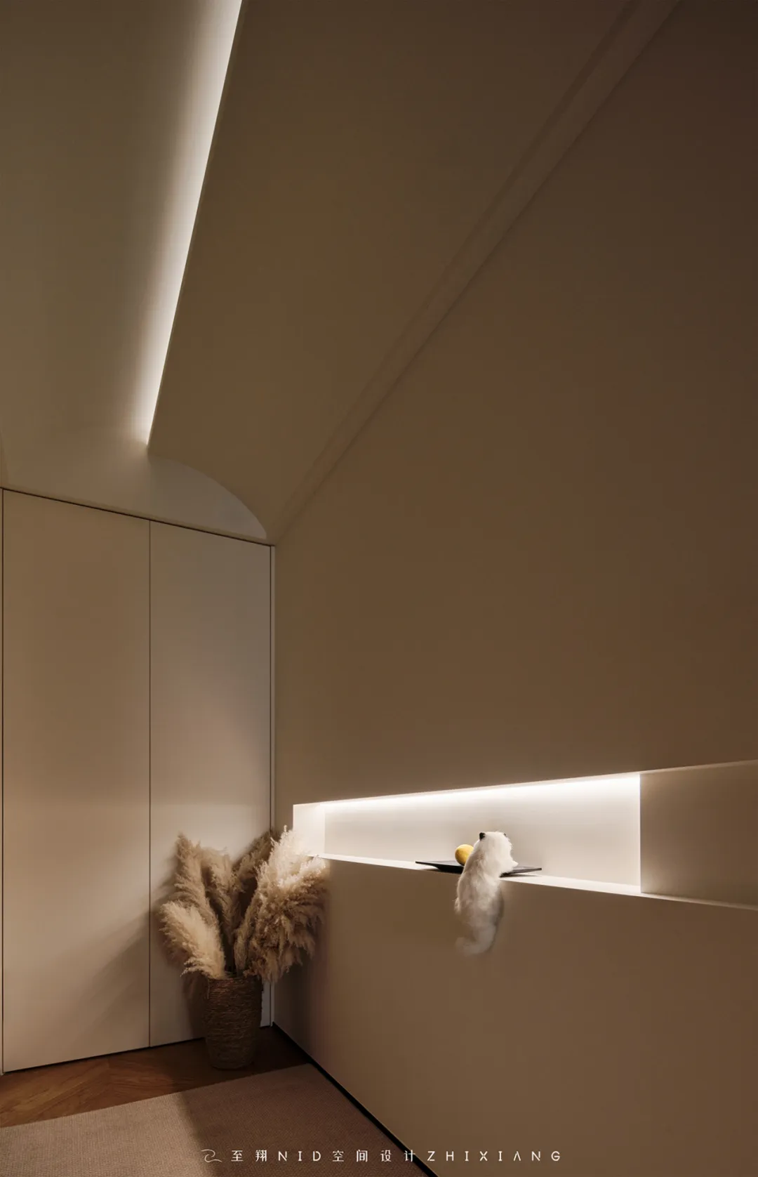
入户玄关走廊左手边定制一处收纳柜,600+mm的深度不仅能做「次净衣区」容纳秋冬季出门穿的外套,还能收纳大件的行李箱,喜欢出门旅游的小伙伴们不要忘记给它们在家找好位置哦~入户玄关右边手侧边定制的木纹色鞋柜,配置了换鞋凳功能,整体鞋柜底部的镂空设计给空间增加了呼吸感,整体过道顶面造型植入弧形的元素,配以灯光拉伸空间视觉感。
Customize a storage cabinet on the left side of the entrance hall corridor, with a depth of 600+mm. It can not only serve as a "secondary clean clothing area" to accommodate outerwear for autumn and winter outings, but also store large suitcases. Don't forget to find a good location for them at home for those who like to travel. The wooden grain shoe cabinet is customized on the right side of the entrance hall, equipped with a shoe changing stool function. The hollow design at the bottom of the shoe cabinet adds a sense of breathing to the space. The curved elements are embedded in the top of the corridor, and the lighting stretches the visual sense of the space.
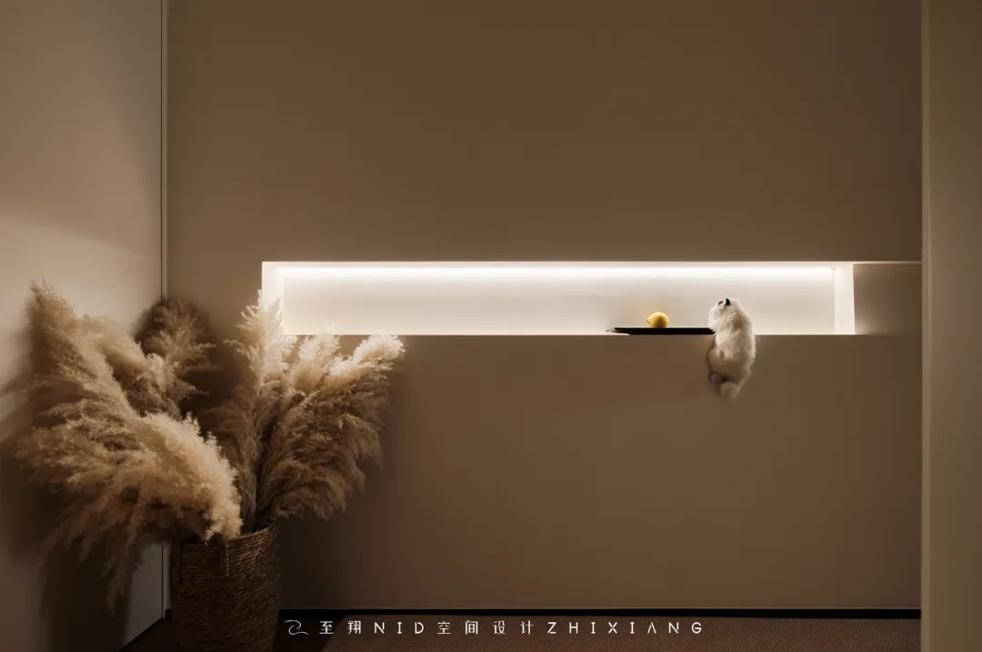
入户玄关对面墙面“掏”出一长条的壁龛造型,极简的设计手法将原来一整面大白墙的无趣性打破。整体造型上方镶嵌的灯带在全屋智能设计配合下,实现了开门回家无需动手,灯光就能亮起换鞋,走过之后光线再缓缓熄灭。
A long niche shape was carved out on the opposite wall of the entrance hall, and the minimalist design technique broke the monotony of the original large white wall. The light strip embedded above the overall shape, combined with the intelligent design of the whole house, realizes the ability to open the door and go home without touching, the light can be turned on to change shoes, and then slowly extinguished after passing by.
02.
The sitting room
Design agency: Zhi Xiang NID space design
客厅
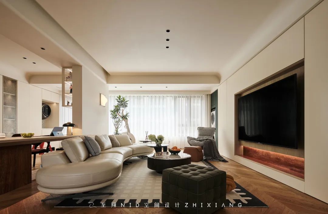
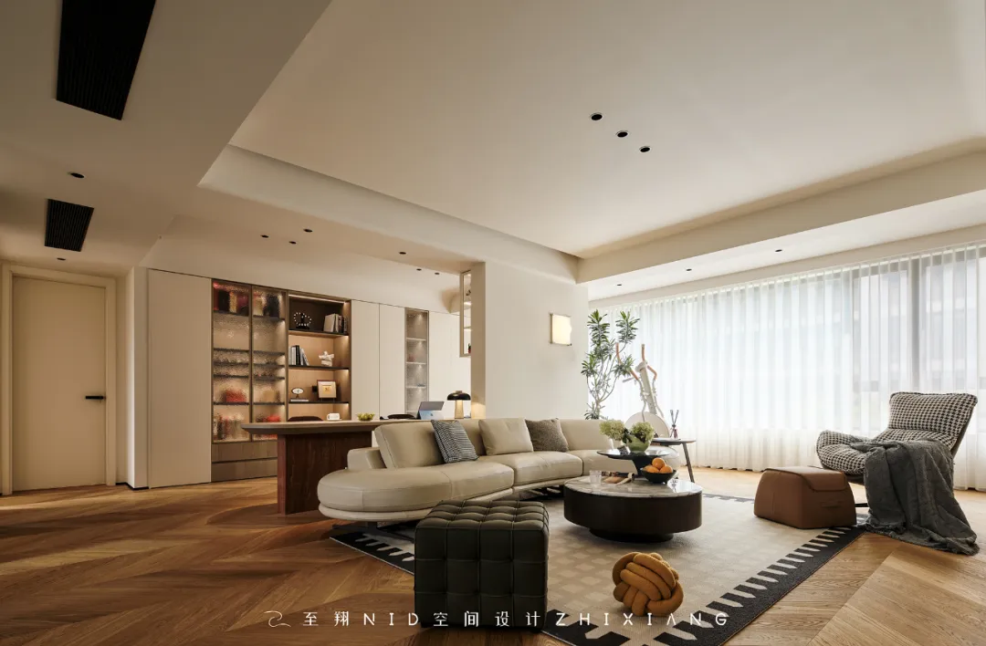

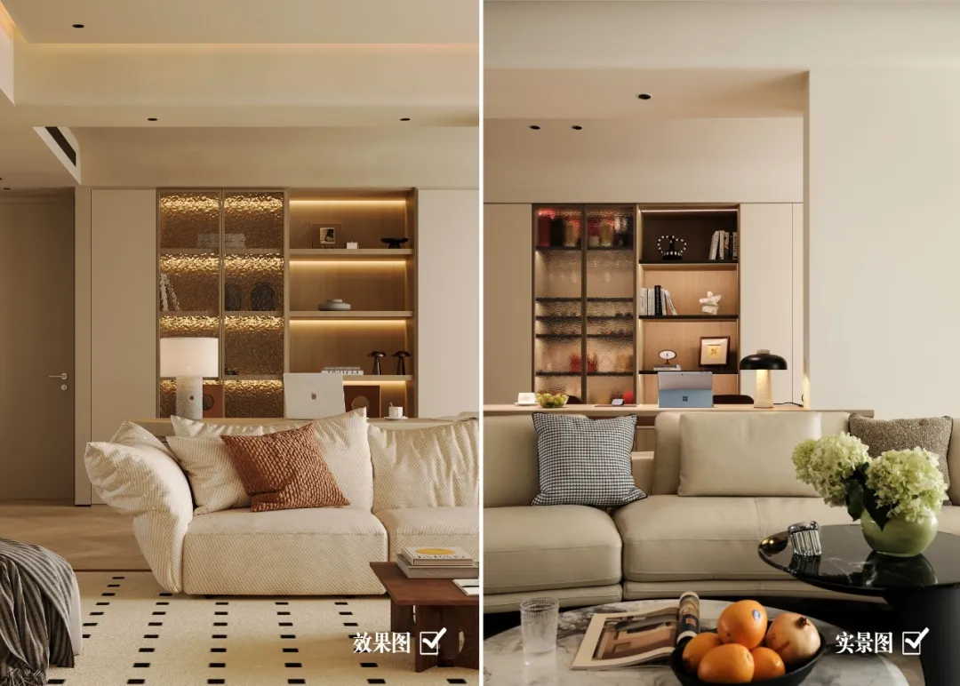
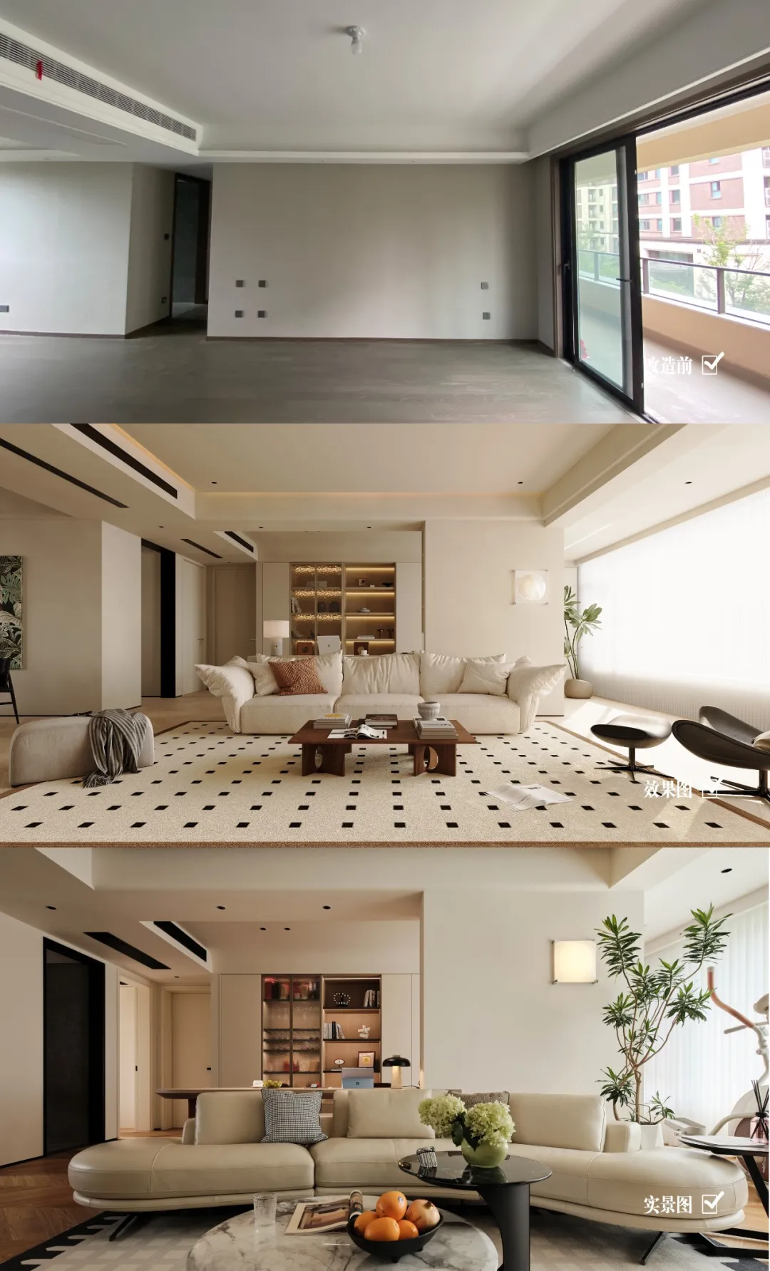
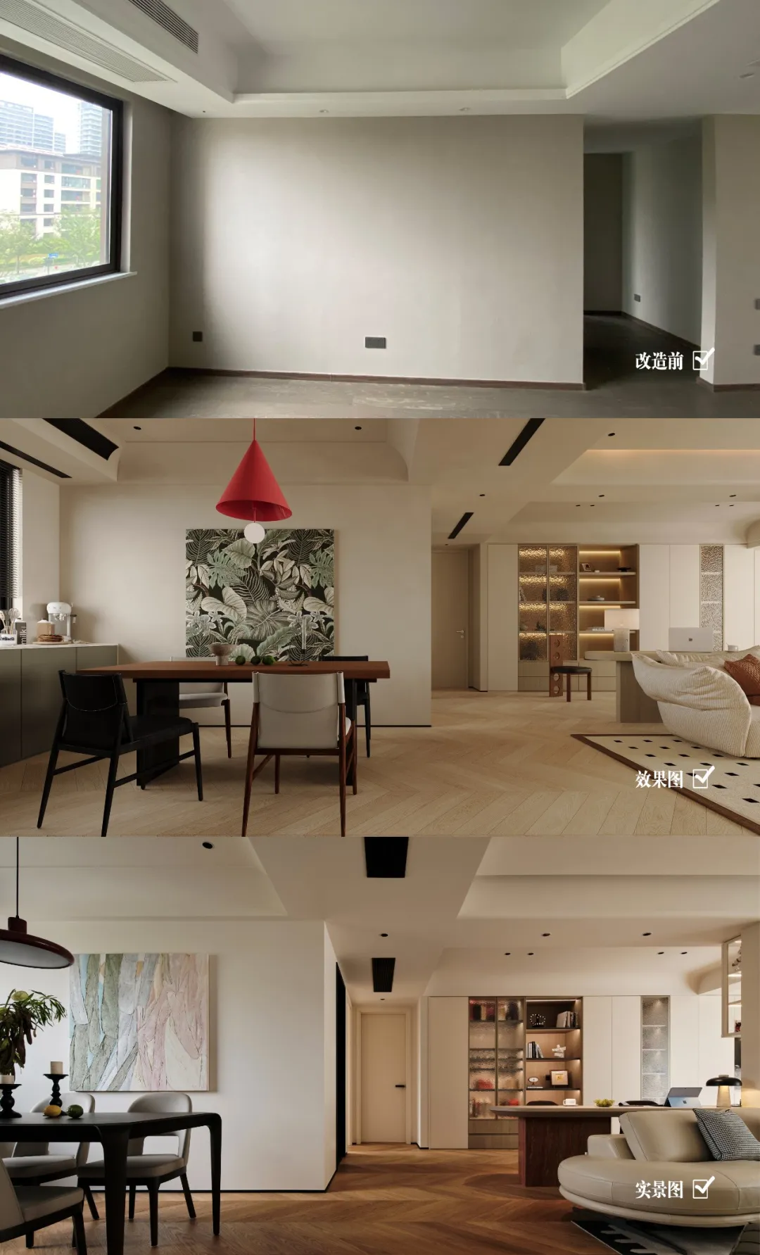
在客厅的设计布局中,设计师为了打造一个「敞开式大横厅」的空间,巧妙地将南面中间卧室墙体打开,增加空间的尺度与延伸感,同时将双向阳台的自然光和户外绿意引入室内(拆除阳台移门),再通过墙顶一色的米色艺术涂料与橡木色地板的巧妙搭配,既拓展了空间的视觉边界,又营造出一种静谧而不失活力的氛围。
In the design layout of the living room, the designer cleverly opened the wall of the south middle bedroom to create an "open style large horizontal hall" space, increasing the scale and extension of the space. At the same time, the natural light and outdoor greenery of the two-way balcony were introduced into the interior (the balcony sliding door was removed). Through the clever combination of beige art paint on the wall top and oak flooring, the visual boundary of the space was expanded, and a quiet yet vibrant atmosphere was created.
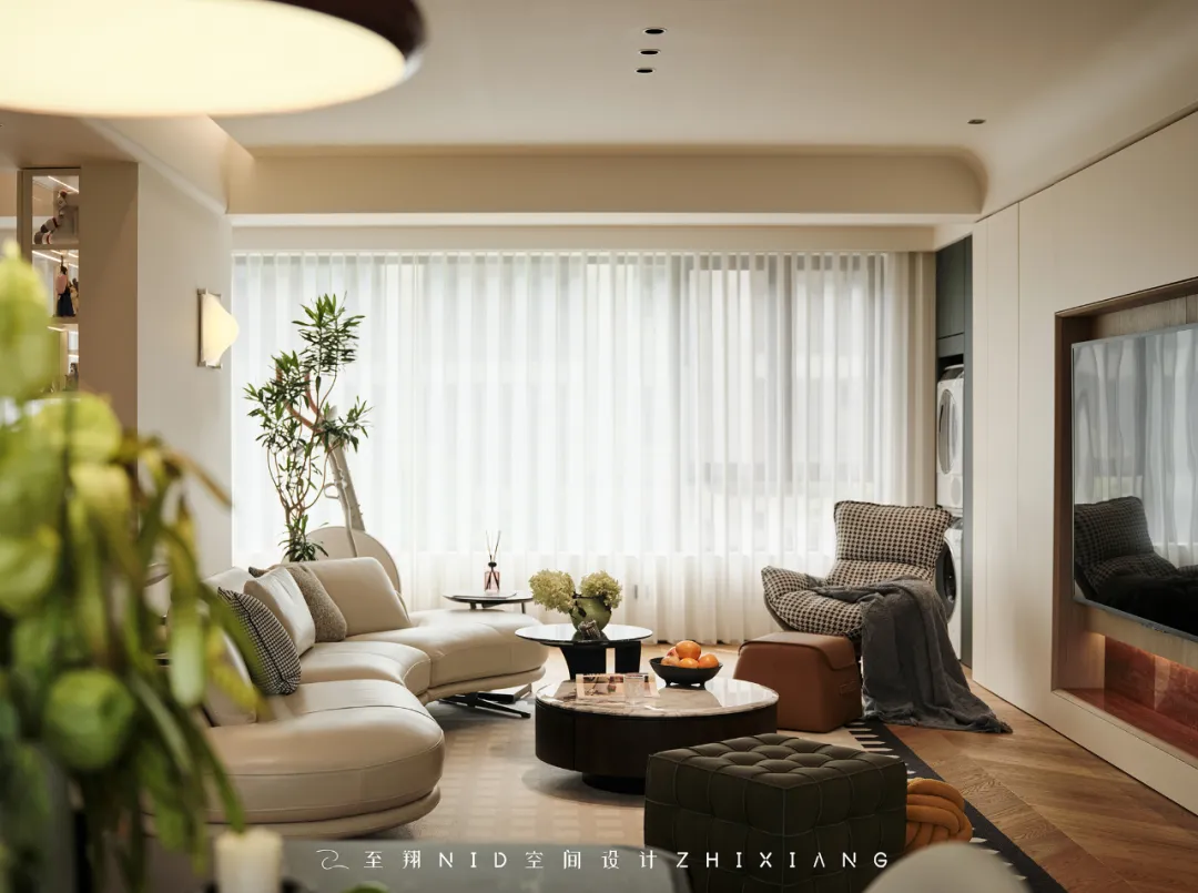
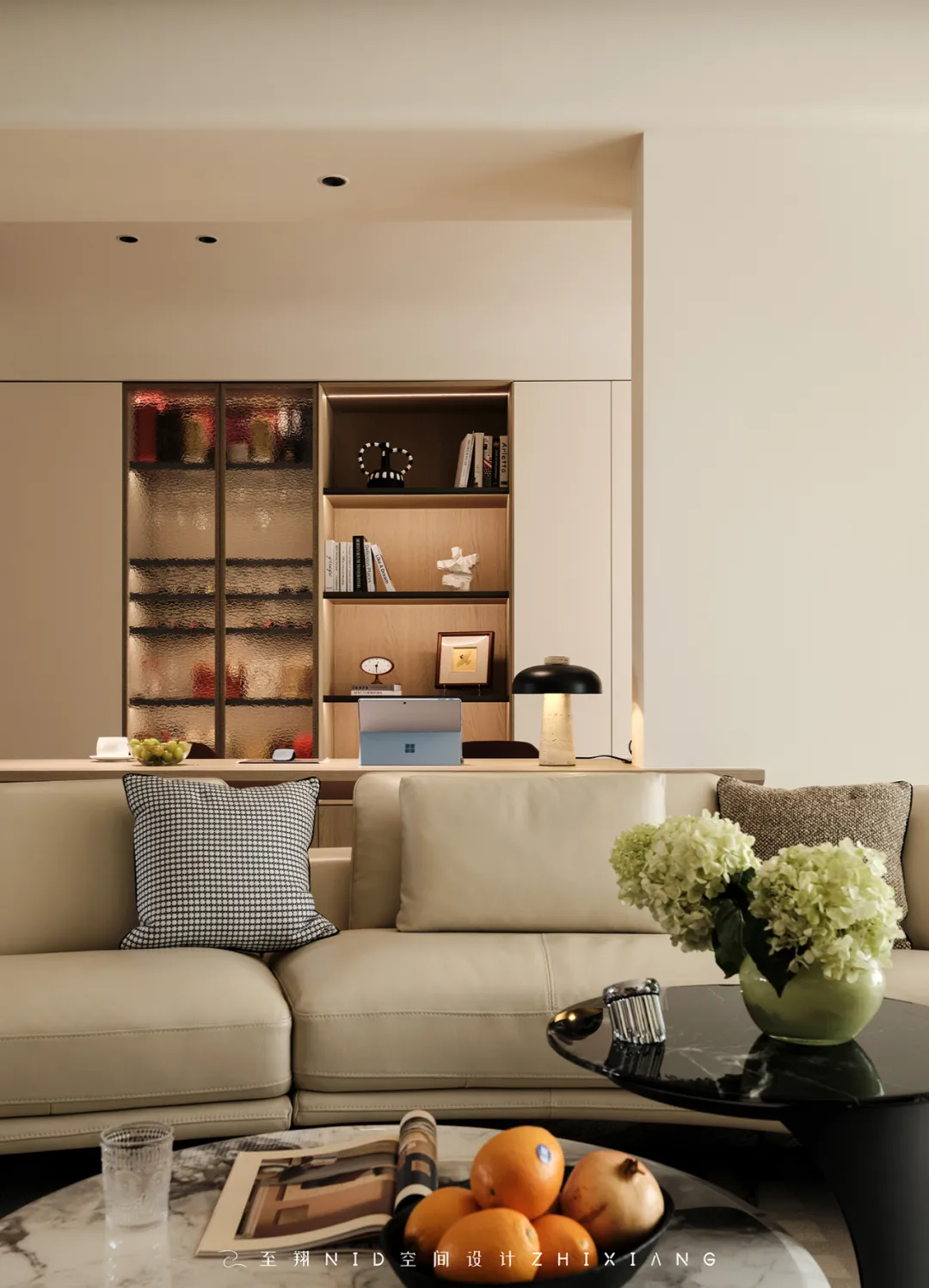
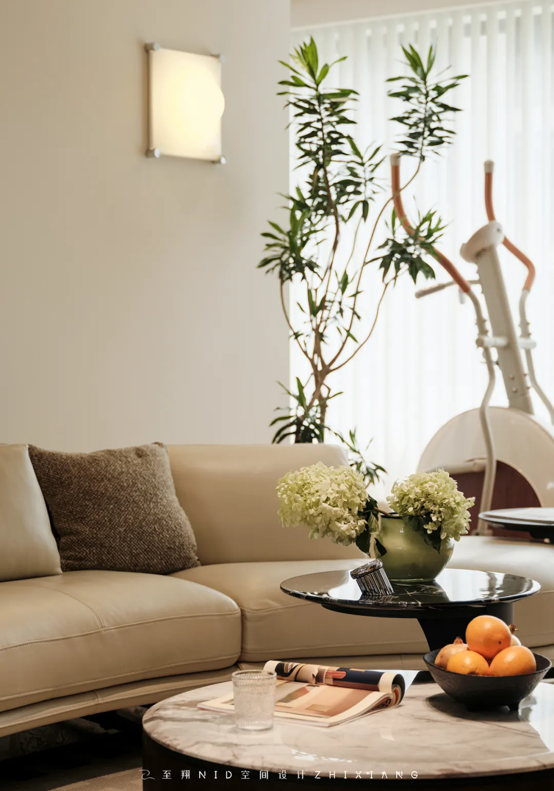
通过梳理空间关系和人物动线,「内」与「外」在这里汇合成统一的场域气质,获得优越的采光与交互性,打造一个多功能公共区域,兼具家庭社交娱乐和居家办公需求~硬装设计上并没有使用过多的设计手法,尽量让空间保持干净整洁,将舞台和空间留给绿植和软装。
By sorting out the spatial relationships and character flow, the "inside" and "outside" converge here to form a unified atmosphere, obtaining superior lighting and interactivity, creating a multifunctional public area that combines family social entertainment and home office needs. The hard decoration design does not use too many design techniques, trying to keep the space clean and tidy, leaving the stage and space for green plants and soft decoration.
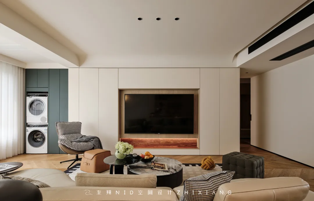
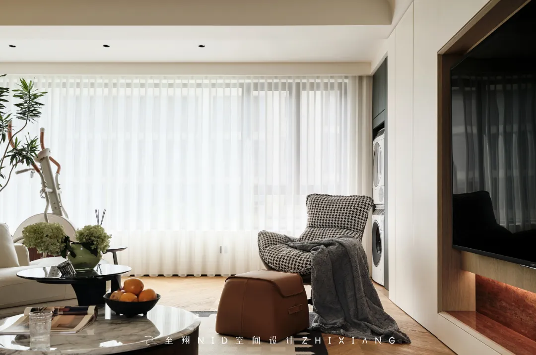
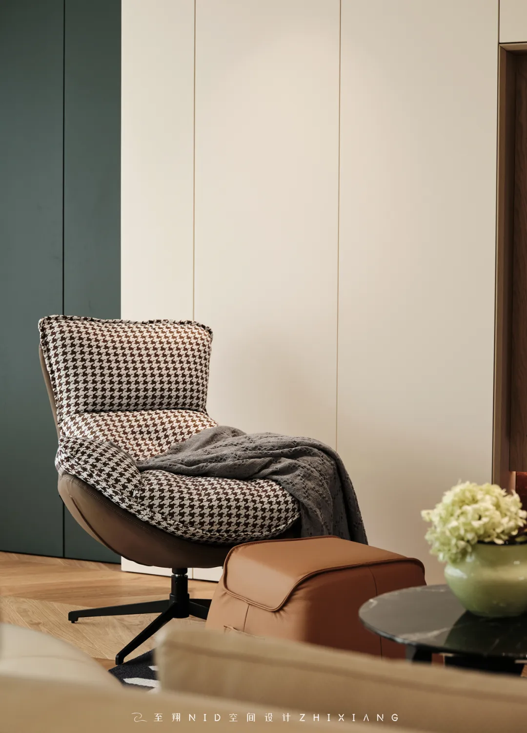

客厅电视背景做了整面储物柜,可以把琐碎的烟火日常都藏入其中(储藏空间也很重要呢~),采用一门到顶的手法,让视觉效果更为整体统一。背景中间内嵌浅木色饰面与天然红洞石材质形成鲜明的对比,营造出强烈的视觉冲击力,阳台洗衣柜(隐藏彩蛋:左侧洗烘叠放,上边有个可抽拉晾衣架,洗好的衣服可以先晾到架子上进行整理再统一晾晒哦~)黛绿色的点缀让空间色彩更加的丰富。
The living room TV background is equipped with a full storage cabinet, which can hide trivial fireworks and daily life (storage space is also important~), using a one door to top approach to make the visual effect more unified. The light wood colored veneer embedded in the middle of the background creates a sharp contrast with the natural red cave stone material, creating a strong visual impact. The balcony laundry cabinet (hidden Easter eggs: stacked on the left side for washing and drying, with a pull-out clothes rack on top, allowing washed clothes to be hung on the shelf for sorting and then uniformly dried~) is embellished with dark green, making the space more colorful.
03.
Restaurant
Design agency: Zhi Xiang NID space design
餐厅
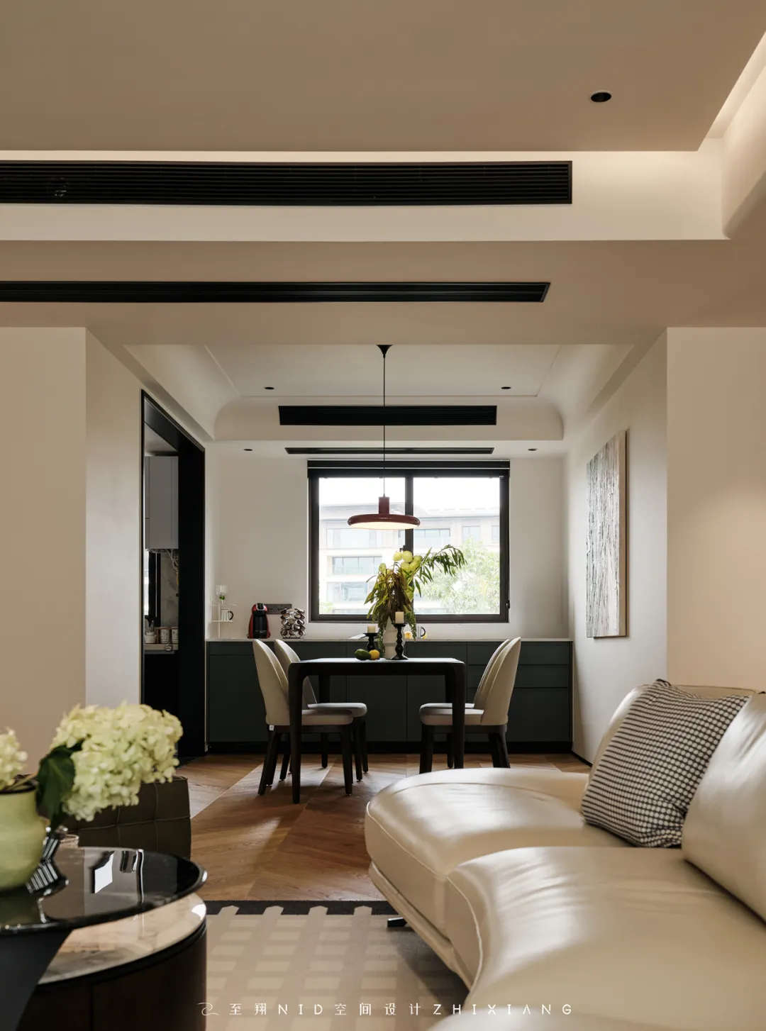
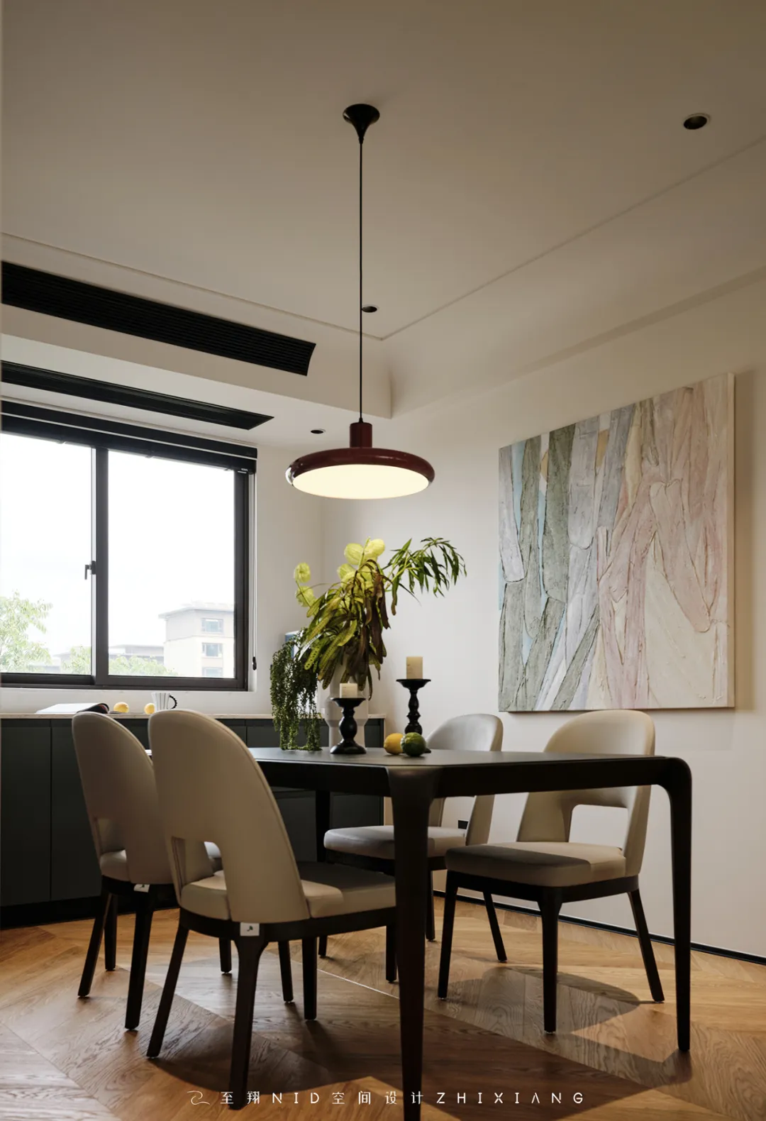

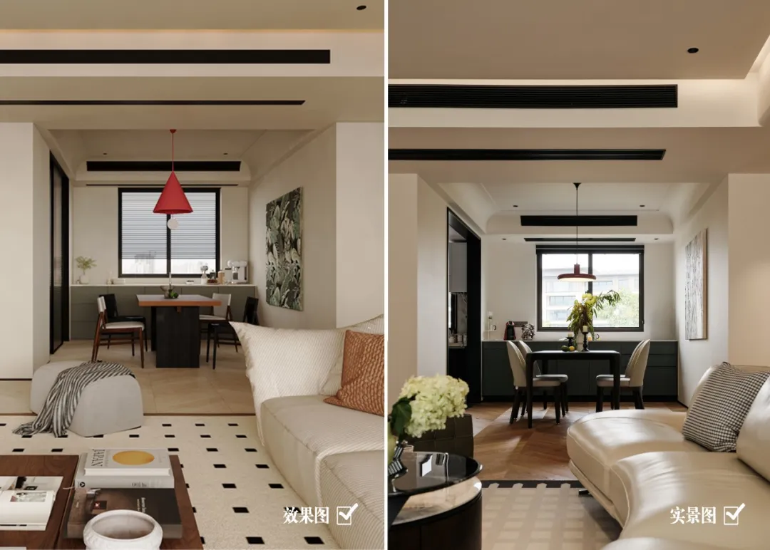
餐厅的设计同样别具匠心,布局上优化家居结构,添加了靠窗「水吧柜」,它兼具餐边柜的储藏和操作功能,黑/白双色的餐桌椅搭配个性的红色吊灯增加整个空间的趣味性和创意性。
The design of the restaurant is also ingenious, optimizing the home structure in terms of layout and adding a "water bar cabinet" by the window, which combines the storage and operation functions of a dining cabinet. The black/white dining table and chairs, combined with the personalized red chandelier, increase the fun and creativity of the entire space.


搭配黛绿的边柜和墙面装饰画,不失现代感和时尚感,又让整个空间更加具有生机。弧形吊顶与灯光设计的巧妙结合,不仅提升了用餐时的温馨氛围,还增强了空间的层次感和艺术感。
Paired with dark green side cabinets and wall decorations, it exudes a sense of modernity and fashion, while also adding vitality to the entire space. The clever combination of curved ceiling and lighting design not only enhances the warm atmosphere during dining, but also strengthens the sense of hierarchy and art in the space.
04.
Kitchen
Design agency: Zhi Xiang NID space design
厨房
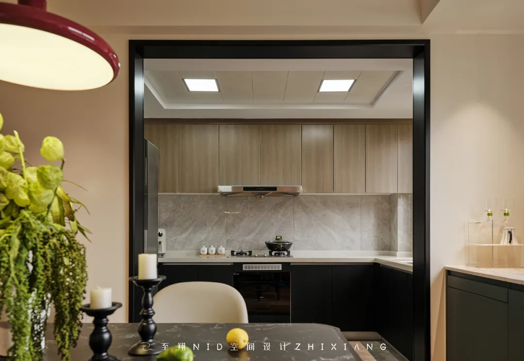
厨房是温润的木纹色配黑色的搭配,走简洁雅酷风格。半敞开式的空间,在这里家人可以共同烹饪美食,享受亲密无间的互动时光,开启全新的家庭沟通模式。
The kitchen features a warm wood grain color paired with black, creating a simple and cool style. A semi open space where families can cook together, enjoy intimate interactive time, and open up a new mode of family communication.
05.
Study
Design agency: Zhi Xiang NID space design
书房

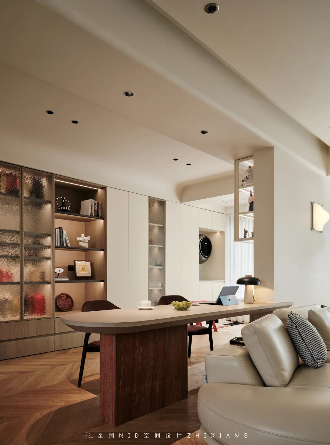
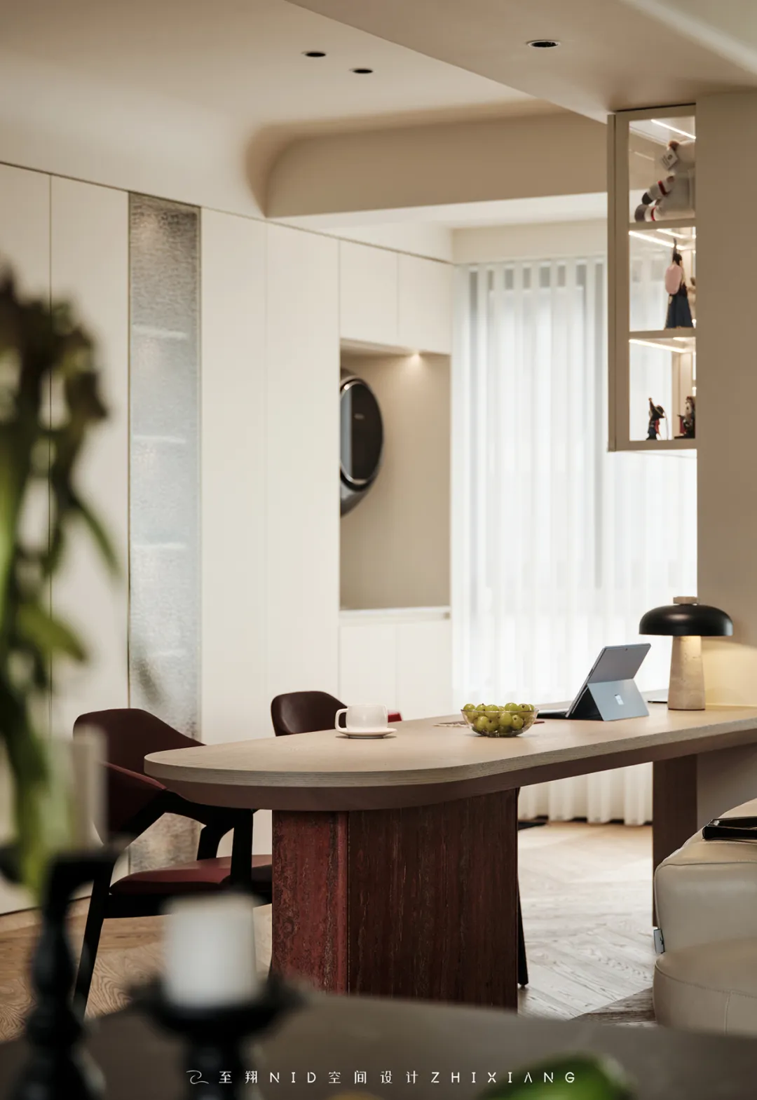


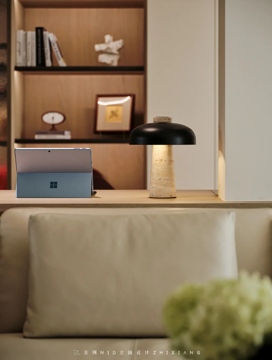
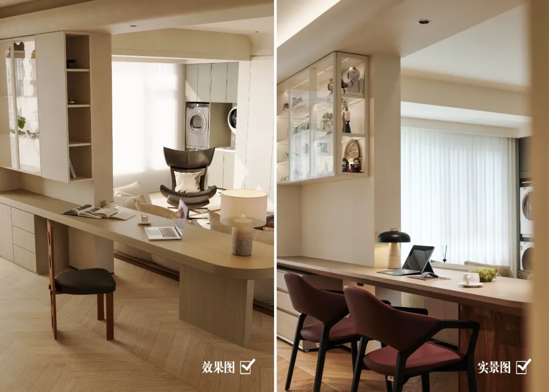
简约而干练的空间,直指设计本源,回归自然而风轻云淡。将南面中间次卧化身为「敞开式书房」(敲掉非承重墙),在这个场所中,通过书房与客厅的穿插,书桌台面与沙发区的串联,实现新功能与传统客厅空间的融合,进而引伸人与人、人与空间的适配共处。靠墙书柜衔接阳台的家政柜左边主要用于收纳家庭清洁工具,上方吊柜收纳闲置物品及清洁用品,下方设置水槽与壁挂洗衣机。(小tip:提前预留插座方便给戴森充电哦~)
A simple and efficient space that points directly to the design essence, returning to nature with a light and airy atmosphere. Transforming the second bedroom in the middle of the south into an "open study" (knocking off the non load bearing wall), in this place, the interweaving of the study and living room, the connection of the desk top and sofa area, achieve the integration of new functions and traditional living room space, and further extend the adaptation and coexistence of people and people and space.The left side of the household cabinet connected to the balcony by the wall bookshelf is mainly used for storing household cleaning tools. The hanging cabinet above stores idle items and cleaning supplies, and a sink and wall mounted washing machine are set up below. (Tip: Reserve a socket in advance for easy charging of Dyson~)
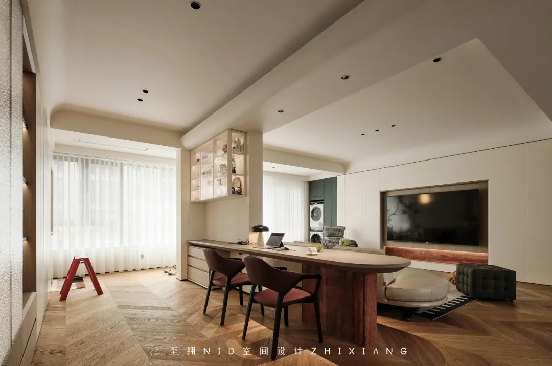
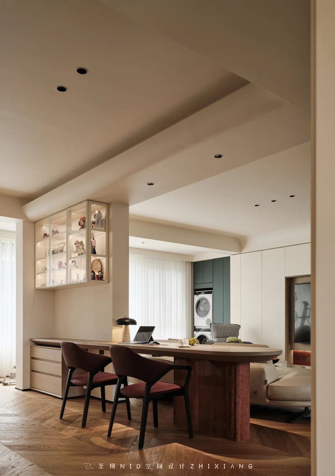
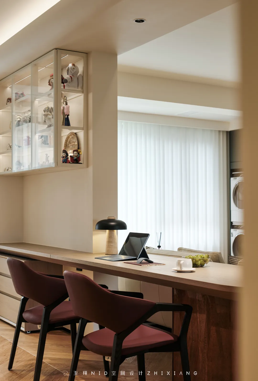
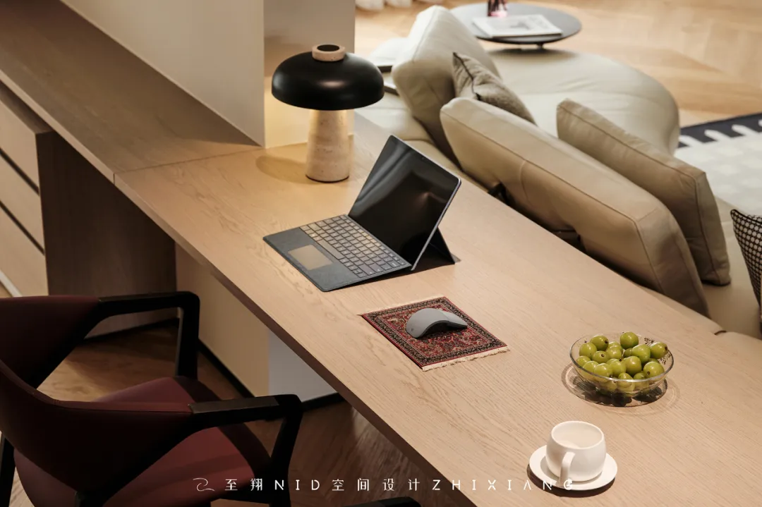
衔接书桌墙面的「全玻璃吊柜」中,展示着业主从全世界游玩带回来纪念艺术品。巧妙设计上的处理,简化承重墙的存在感,让艺术品成为吸睛的亮点。敞开式阳台(拆除阳台移门)引景入室,让阳光与风景流动于空气中,巡游动线还增强了空间的层次感和艺术感。
In the "all glass hanging cabinet" connected to the desk wall, there are commemorative artworks brought back by the owner from around the world. Cleverly designed treatments simplify the presence of load-bearing walls, making artworks eye-catching highlights. An open balcony (with sliding doors removed) leads the view into the room, allowing sunlight and scenery to flow through the air. The parade route also enhances the sense of hierarchy and art in the space.
06.
Master bedroom
Design agency: Zhi Xiang NID space design
主卧室

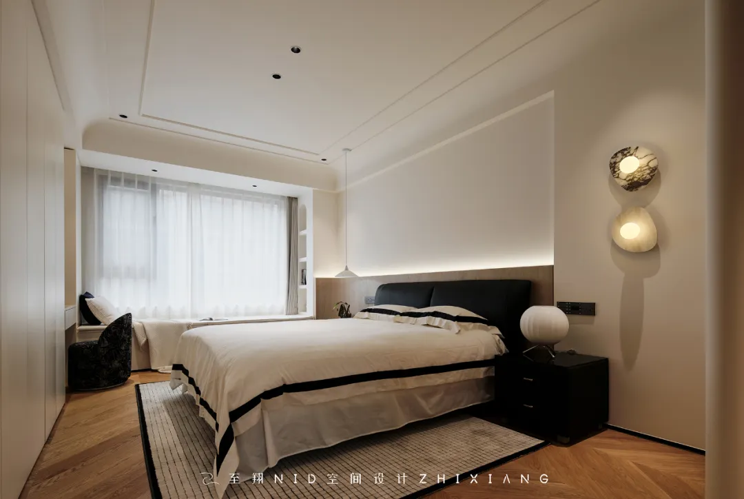
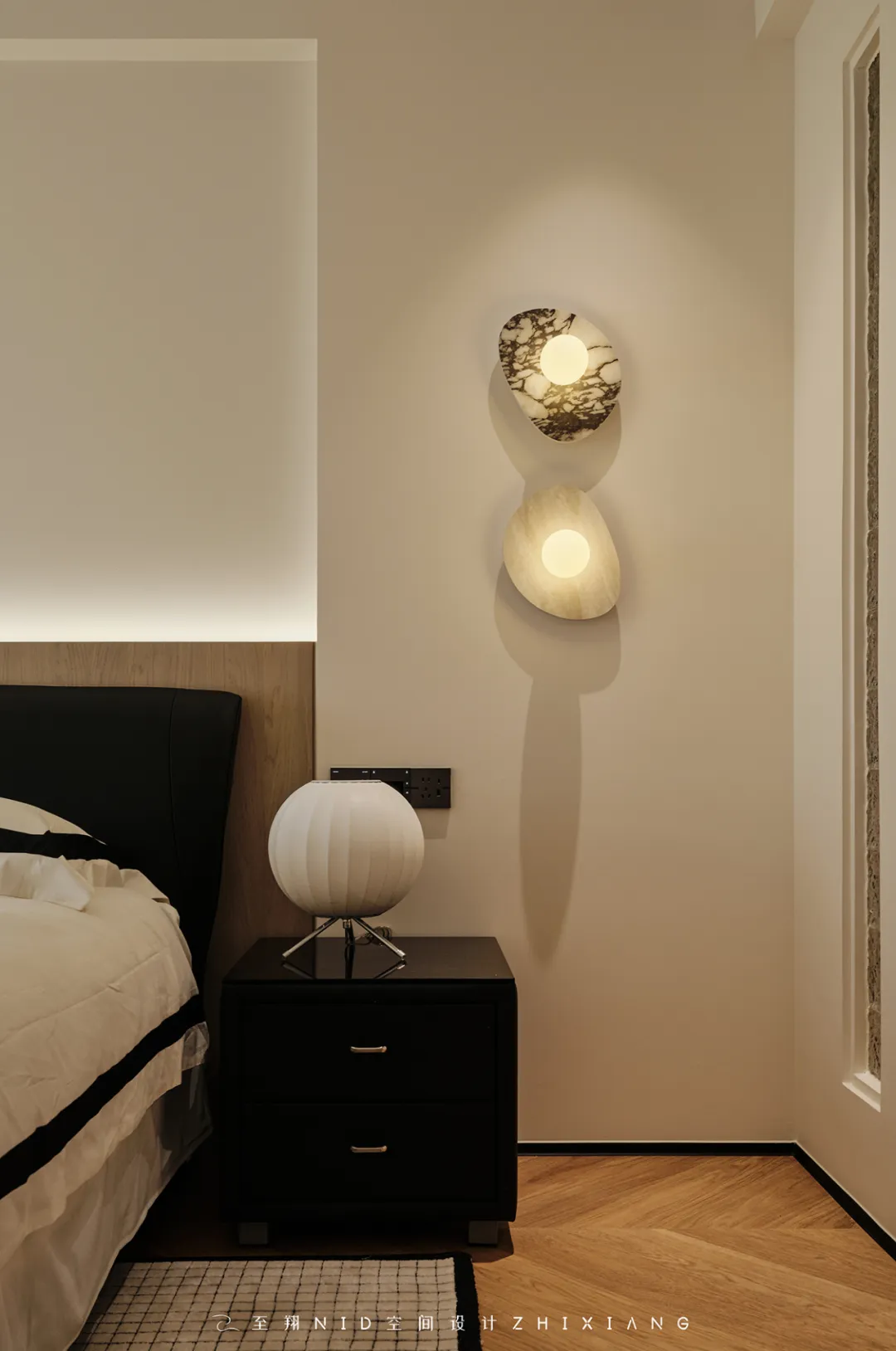
主卧风格延续整体的浅色奶油风,从结构的角度出发,对每个日常的功能区进行深析,只保留了必要的线性结构,重新规划布局结构后,强调私密性和舒适度。主卧室床头墙面做了「天然木皮护墙板造型」和镶嵌「水波纹玻璃砖」的隔断造型,温馨浪漫透光性良好也不失美观。原本的飘窗增加了开放柜,既可以用作休闲区,又可以用来储藏和展示。整体空间搭配深色元素家具散发着一种质朴、温暖、松弛且发自内心智慧所抵达的优雅。
The master bedroom style continues the overall light cream style, with a deep analysis of each daily functional area from a structural perspective, retaining only necessary linear structures. After re planning the layout structure, emphasis is placed on privacy and comfort. The head wall of the master bedroom has been designed with a natural wooden veneer wall panel and a partition embedded with water ripple glass bricks, creating a warm and romantic atmosphere with good transparency and aesthetic appeal. The original bay window has added open cabinets, which can be used as both a leisure area and for storage and display. The overall space, paired with dark furniture elements, exudes an elegance of simplicity, warmth, relaxation, and heartfelt wisdom.
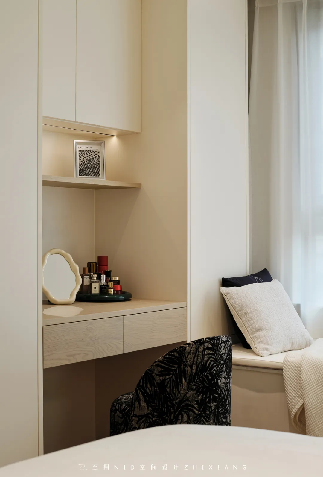
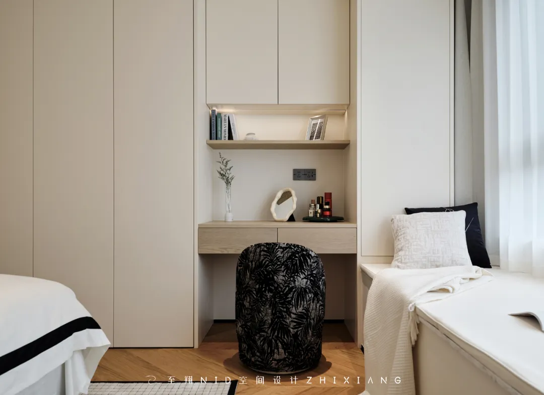
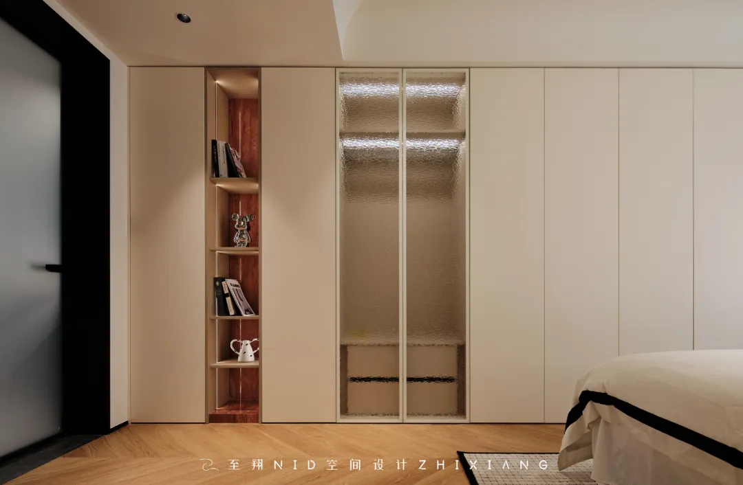
主卧室床尾部分设计了一整排的衣帽柜组合,靠左边的位置设计了镶嵌天然红洞石材质拼接的开架用于展示,靠右边窗户部分的桌面既可以用来梳妆,也可以用来办公。衣帽柜隐形的柜门把手方案,使平整的门板还能当做投影幕布去使用(无需再安装投影幕布轴)比较简洁也比较轻盈~
A row of wardrobe combinations is designed at the end of the master bedroom bed, and an open shelf inlaid with natural red cave stone material is designed on the left side for display. The desktop on the right window can be used for dressing or working. The concealed cabinet door handle scheme of the wardrobe allows the flat door panel to be used as a projection screen (without the need to install a projection screen axis), which is relatively simple and lightweight~
07.
Toilet
Design agency: Zhi Xiang NID space design
卫生间
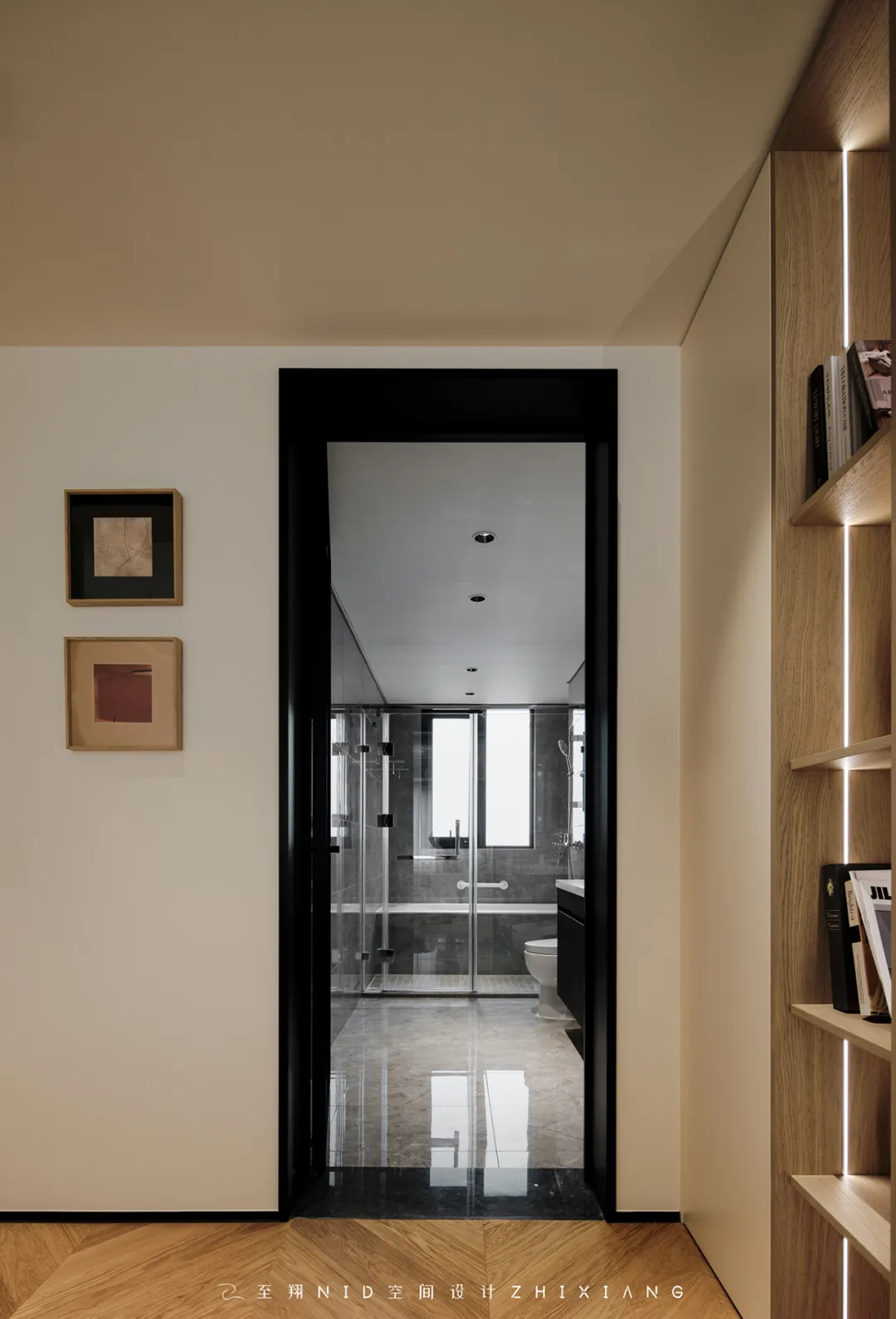

卫生间色系黑灰配色,来点木纹,集吊柜储纳+双盆洗漱池于一体简约时尚!三分离的设计让两个人互不干扰,同时使用这个区域没有压力,主卧本身就是一个家庭里私密性的场所,门一关,不会被人随意进出的卧室,想怎么开阔就怎么开阔。
The bathroom color scheme is black and gray, with a touch of wood grain. It integrates hanging cabinet storage and double basin washbasin in a simple and fashionable way! The three separate design allows two people to not interfere with each other, and there is no pressure to use this area at the same time. The master bedroom itself is a private place in the family, and once the door is closed, the bedroom will not be entered or exited by people at will. It can be opened as much as you want.
08.
Parents room
Design agency: Zhi Xiang NID space design
父母房
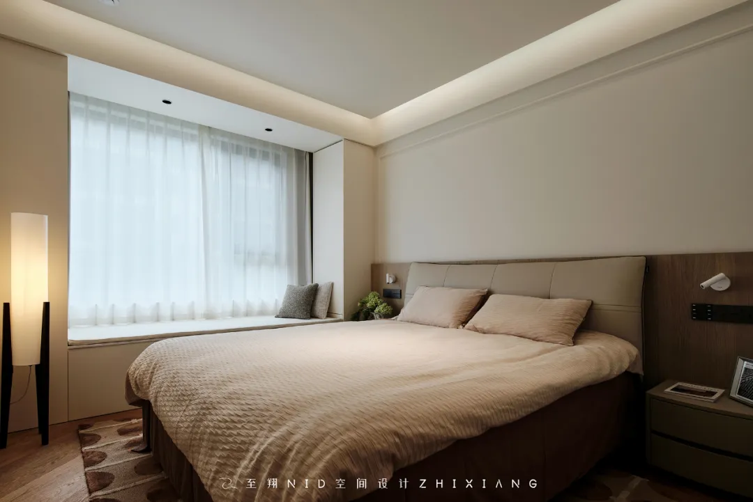
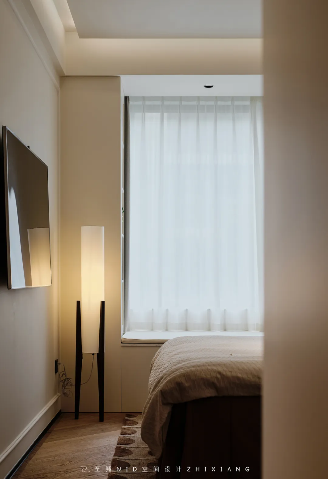
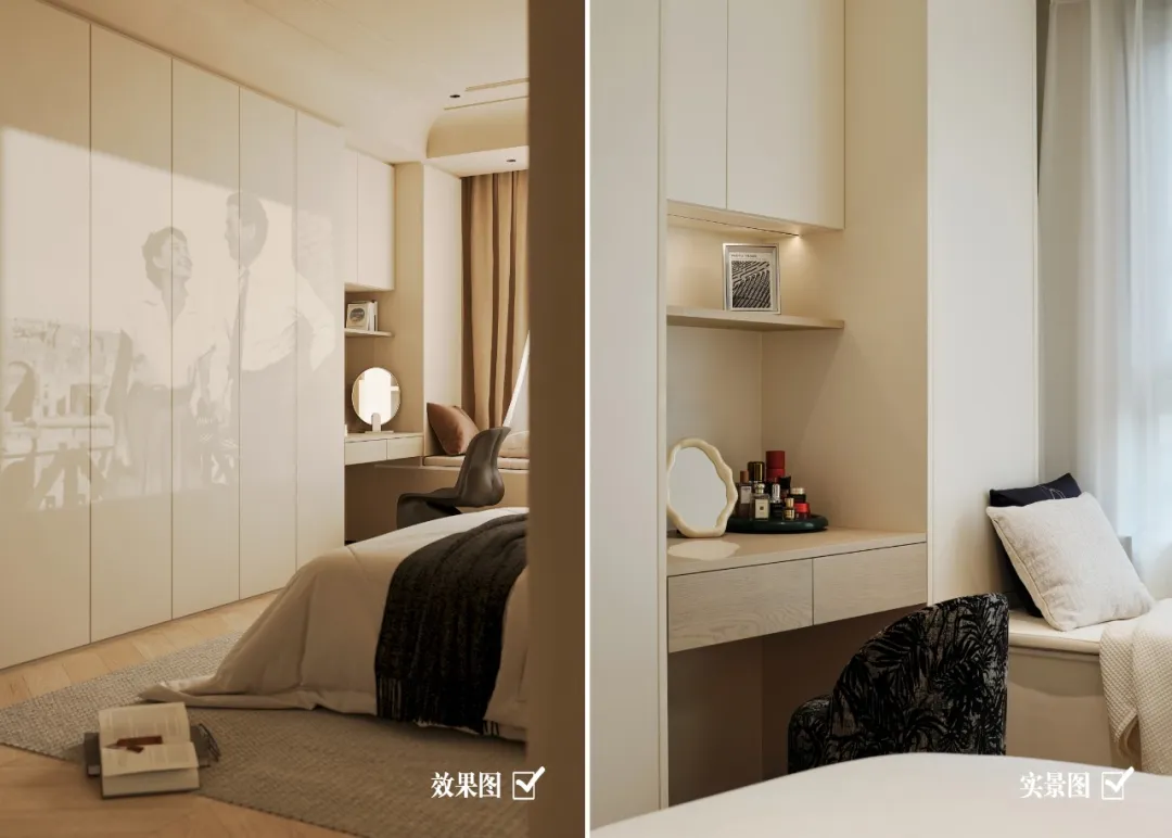
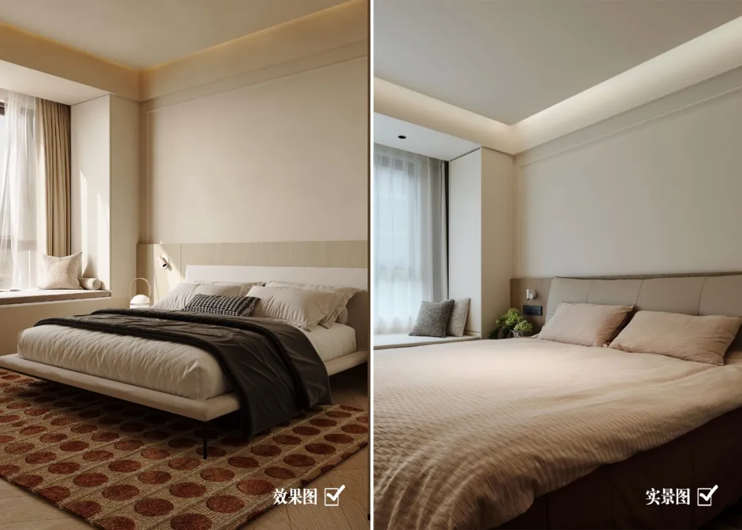
强调空间素净的底色则是因为对“必要性”的极致推演,我们希望设计本身可以摒弃不必要的存在,在保证实用的基础上尽量精简,软装上的色彩点缀,房屋的调性拉满,延续了客厅的色彩搭配组合,浅木色和艺术涂料气质凸出。床背后的壁灯考虑使用者的细致需求,提高生活适配性,围绕空间服务于人的思想进行设计增减。
The emphasis on a clean and natural base color in the space is due to the ultimate deduction of "necessity". We hope that the design itself can eliminate unnecessary existence and simplify as much as possible on the basis of ensuring practicality. The color embellishment on the soft decoration and the tone of the house are fully expressed, continuing the color matching combination of the living room. The light wood color and artistic paint temperament are prominent. The wall lamp behind the bed considers the detailed needs of the user, improves the adaptability of life, and is designed with the idea of serving people in space.
09.
Guest bedroom
Design agency: Zhi Xiang NID space design
客卧
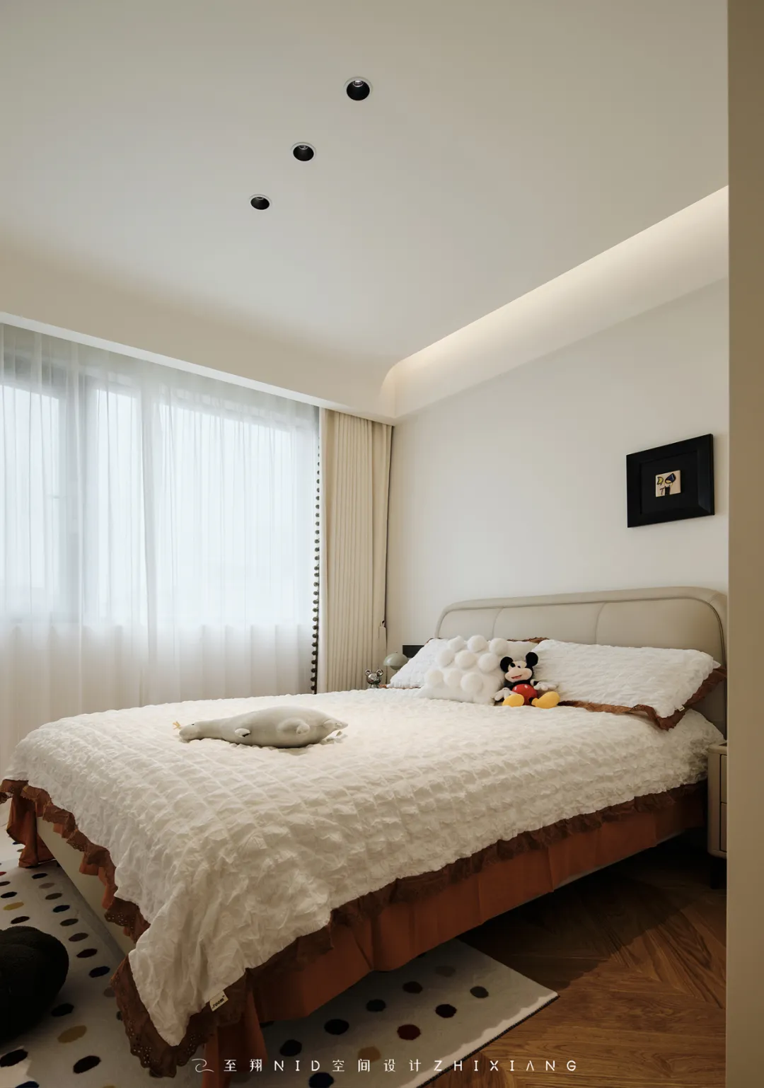
客卧面积不大,放了1.5m的床,两侧的空间就变得更紧凑了。所以房间的搭配思路基本都遵循“木色系+米色”的配色逻辑,地面是通铺的橡木色鱼骨拼地板配合浅色家具,空间像张自由的画布可以任意切换软装风格~
The guest bedroom area is not large, with a 1.5m bed placed, the space on both sides becomes more compact. So the matching ideas of the rooms basically follow the color matching logic of "wood color series+beige". The floor is paved with oak colored fishbone and light colored furniture, and the space is like a free canvas that can be freely switched between soft decoration styles~
毛坯-效果图-实景图前后对比
门厅

客厅


餐厅

书房
主卧室

父母房
过道
-至翔NID空间设计-
E N D

版权声明
本文均为至翔NID原创,请勿盗用
如需转载本文或商业合作,请邮件联系:1219449110@qq.com
如果您喜欢【至翔NID空间设计】
可以“推送”或“分享”给身边的朋友
标签:
热门资讯排行
- 资讯专区
- 图片专区
- 品牌专区


