至翔NID实景作品 | 当归
至翔 NID 空 间 设 计
ZX NID space design
Hard installation design
/
Soft installation design
感谢您关注至翔NID空间设计
Thank you for your attention to ZX NID design
Hard installation design & soft installation design
ZX NID design team
Changshu,Suzhou,China
2024
项目名称 | Name :当归
项目坐标 | Address :苏州 .常熟春江名筑
项目风格 | Style :北欧极简
设计机构 | Design :至翔NID空间设计
施工单位 | Consturuction :至翔精筑
设计时间 | Design time :2022·10
拍摄时间 | Shooting time :2023·10
项目面积 | Area :189㎡
摄影计构 | Photography :一家美室

至翔NID空间设计
像风一样自由,感受原木风范的轻奢。纵然世界变迁,始终守住内心的一份纯真,不追求奢华的主流,仅仅一笔简洁描绘,或许就是心中想要的全部。
「 Design & Appeal | 设计&诉求 」
这是一套189㎡的江景大平层,北欧极简也能好看到这种程度,一种干净与温暖达到极致的美感!
当归,当归,台湾当归。本案是一对在苏州常熟工作的年轻的台湾夫妻,带一对儿女在常熟生活。也是想等新居好了接父母在大陆生活。所以在功能上希望要满足儿女父母六口之家的功能需求,对于收纳与储物功能非常重视,希望新家具备强大的收纳功能,所有的东西都能有地方去收拢。浅色温馨,每一处都有亮点!
接受此次全案设计委托,至翔NID空间设计团队尤为重视。因其不仅肩负着对年轻夫妇“爱巢”设计的重任,它还将承载并记录一个六口之家的未来幸福生活,更多专属而丰富的生命情感记忆。
「 Family changes | 户型改造 」
入户门需更换,地砖用浅色砖 不要亮面的,柜子喜欢哑光质感,墙壁刷乳胶漆,主卧浴室放个浴缸,靠近阳台做个工作台,收纳柜能多就多,每个房间预留网线做全屋wifi,新风系统,家具及柜子需用enf级无醛材料,净水器,不做中央空调 地暖,客厅风管机 卧室挂机,客厅留个位子放猫爬架,尽量少做开放格 怕猫跳上去翻东西等..... 未来营造简洁明快温馨感的居住空间。
改造点:
1. 入户门正对着主卧房门(风水上不是很好)
2. 中厨房空间格局空间不够理想
3. 餐厅功能性不够多
4. 南北阳台空间不够饱满
5. 卧室储藏空间少
6. 儿童房功能性少
改动:
1. 改变主卧室房门位置,改善入户之间对着房门问题。
2. 中厨扩大空间,操作台面增加,高低操作台面,更符合人体学。
3. 西厨 餐厅 利用北阳台空间增加操作台面增加岛台与餐桌结合扩大餐厨空间。
4. 南北阳台贯通客餐厅空间,增加整体功能空间。
5. 改变卧室格局增加储藏功能空间。
6. 拆除非承重墙体,使儿童房空间增加。利用通透玻璃和雾化玻璃的交换,加空间灵动感。
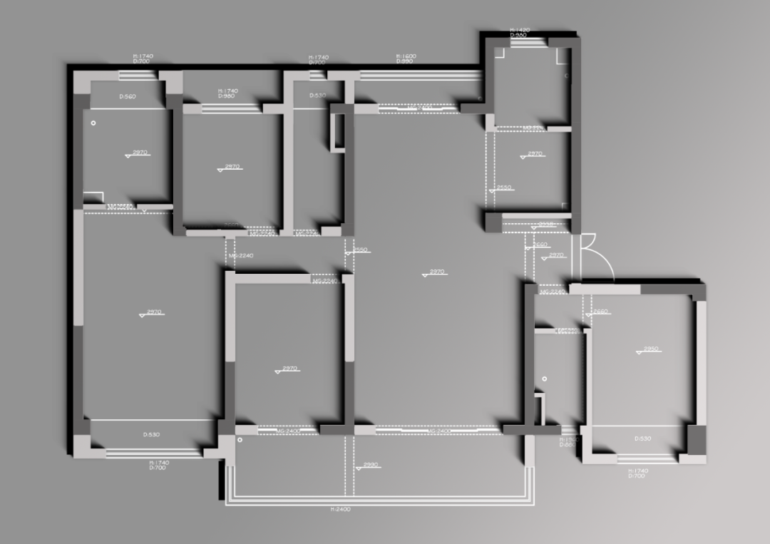
原始结构图
01.
Vestibule
Design agency: Zhi Xiang NID space design
玄关
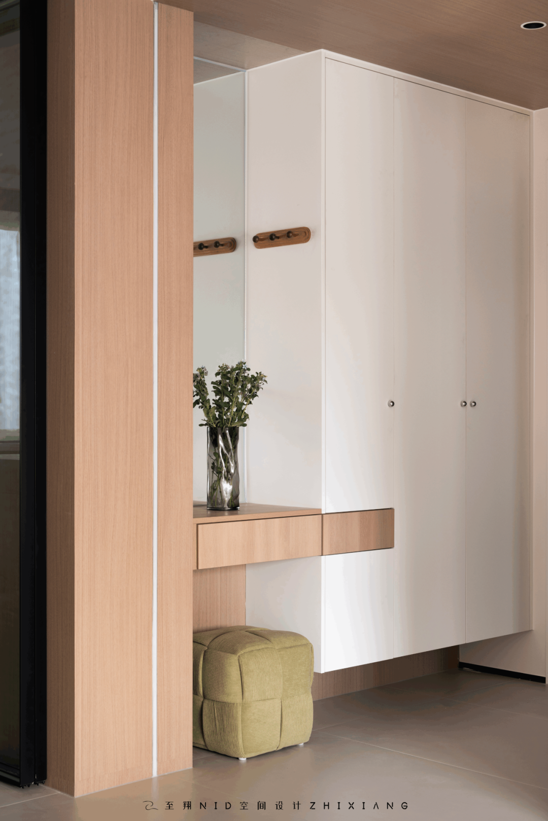
门厅鞋帽柜功能增加,悬空柜下好收纳拖鞋。挂衣板,穿衣镜,换鞋凳方便又实用。穿插式抽屉柜既有设计感又有功能性,能放钥匙口罩消毒液。贯穿顶部木饰面吊顶与墙面木饰面吊顶相呼应,墙面线性灯设计,增加氛围感。
主卧改变格局后,避开入户门对房门的不好风水格局。同时增加走廊尽头半通透感玄关背景,设计感拉满。
Foyer shoe and hat cabinet function to increase the hanging cabinet under the slippers good storage. Hanging board, mirror, shoe stool, convenient and practical. The interspersed chest of drawers has both design and functionality, and can hold the key mask disinfectant. Through the top wood veneer ceiling echoes the wall wood veneer ceiling, and the wall linear light design increases the atmosphere.
After the master bedroom changes the pattern, avoid the bad feng shui pattern of the door to the door. At the same time, the semi-transparent porch background at the end of the corridor is increased, and the design sense is full.
02.
Sitting room
Design agency: Zhi Xiang NID space design
客厅
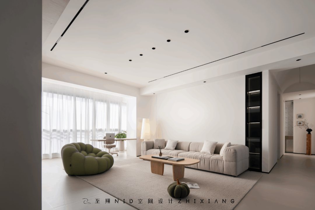
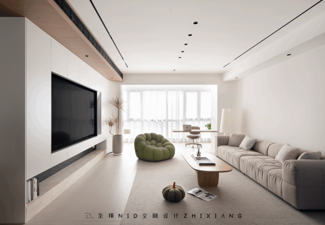
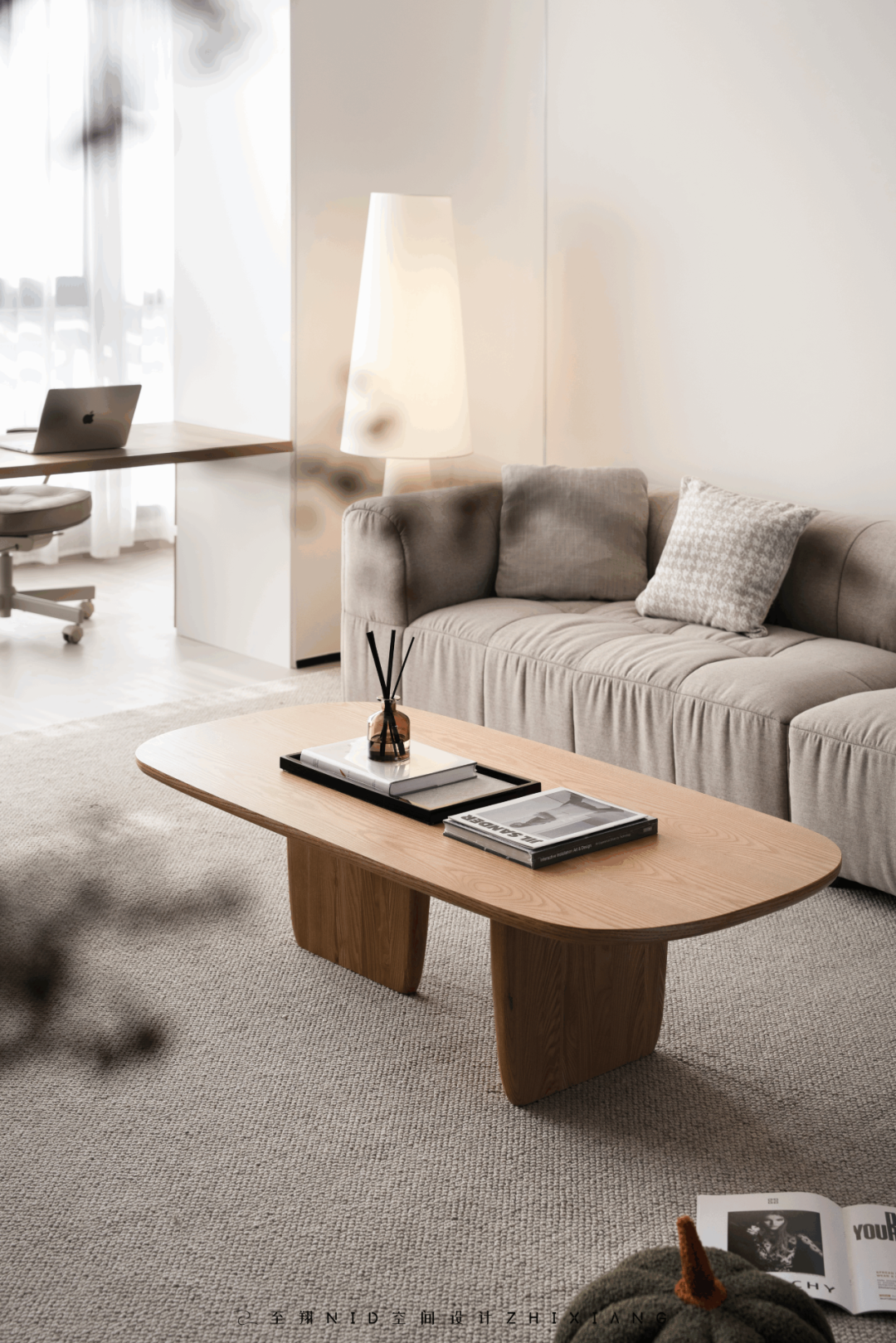
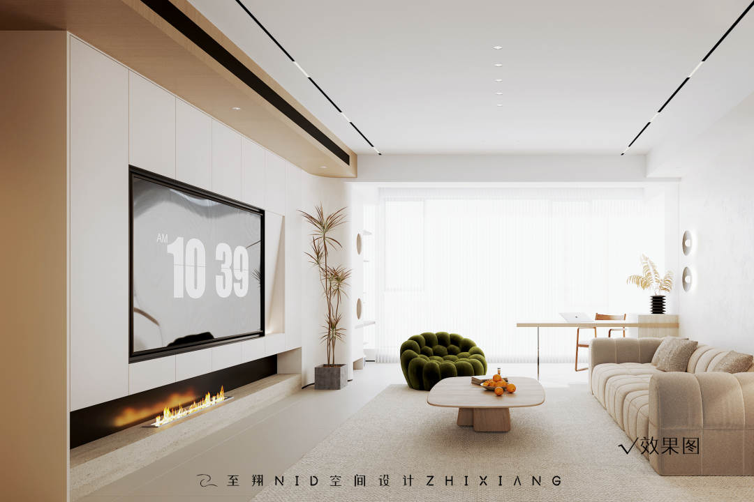
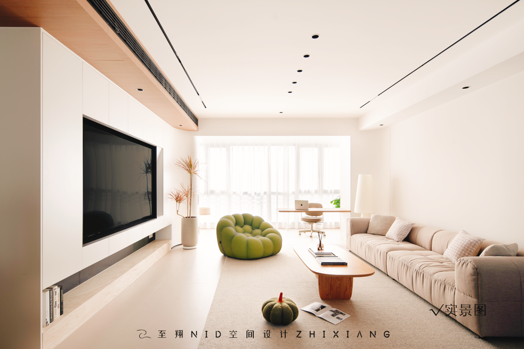
错过了多巴胺,这套温暖的美拉德风可别错过啦!米色、黑色细腻木纹与俏皮绿色搭配真的太适合啦!同时让空间充满温馨活泼气息也将氛围感直接拉满。客厅以半环绕式动线摆放,茶几,单人沙发椅,聊天,看书的地方,孩子的玩乐,电玩游戏,作为全家互动玩乐放松身心的区域。
If you miss dopamine, don't miss this warm Melard! Beige, black and delicate wood grain with playful green is really perfect! At the same time, the space is full of warm and lively atmosphere, and the atmosphere is directly filled. The living room is placed in a semi-surround type moving line, coffee table, single sofa chair, chatting, reading place, children's play, video games, as the whole family interactive play and relax the body and mind area.
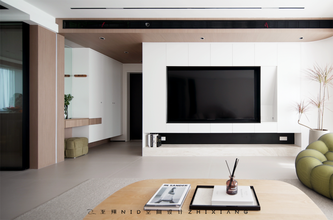

整排电视柜设计,打造超多功能收纳空间,孩子的游戏机,镂空柜面方便宝贝换取游戏卡,收纳柜又能储藏大量玩具书籍。
The whole row of TV cabinets is designed to create super multi-functional storage space, children's game consoles, hollow cabinets are convenient for babies to exchange game cards, and storage cabinets can store a large number of toys and books.
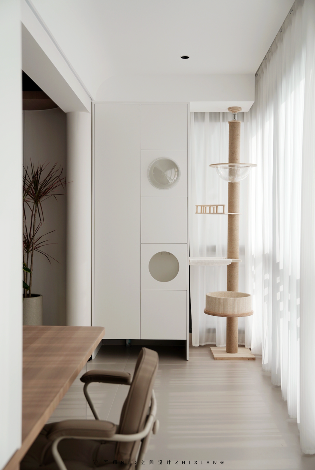
连贯阳台空间,因为家中还有两只猫主子,专为猫主子设计独立猫舍空间,玩乐休息一体,多余空间还有居家清扫工具收纳空间。收纳柜做无底柜设计,收放扫地拖地一体机。上柜收纳清扫用品工具柜。
Connected balcony space, because there are two cat owners at home, designed for the cat owners independent cattery space, play and rest together, extra space and home cleaning tools storage space. The storage cabinet is designed as a bottomless cabinet, and the sweeping and mopping machine is collected and placed. Cabinet for cleaning supplies and tools.
03.
Balcony
Design agency: Zhi Xiang NID space design
阳台
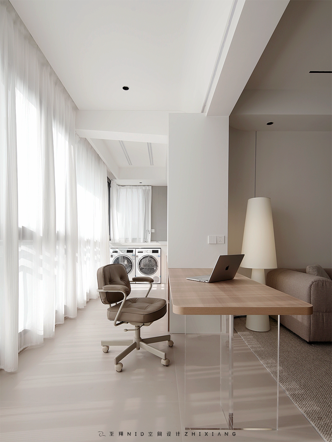
阳台打通客厅,因为女主人的工作需求,为期打造一个开放式独立工作室空间,超大工作台面,工作用具收纳空间,连贯生活阳台收纳柜。平排洗衣烘干机收纳空间。隐藏式升降晾衣架,无处不在的设计。工作区轻松舒服,工作台即可作为茶台,又能拉近家人之间的距离,营造出温暖的家庭氛围。
The balcony opens up the living room, because of the work needs of the hostess, to create an open independent studio space, a large work surface, a storage space for work appliances, and a coherent living balcony storage cabinet. Horizontal washer-dryer storage space. Hidden lift drying rack, omnipresent design. The working area is relaxed and comfortable, and the workbench can be used as a tea table, which can narrow the distance between families and create a warm family atmosphere.
04.
Dining room
Design agency: Zhi Xiang NID space design
餐厅
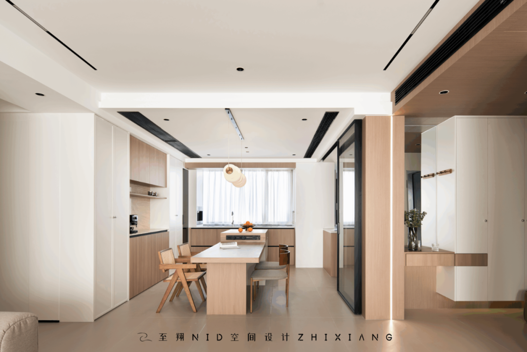
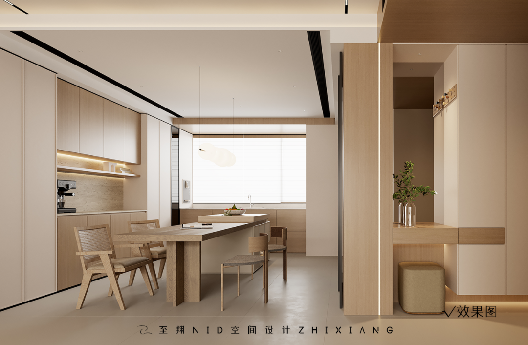
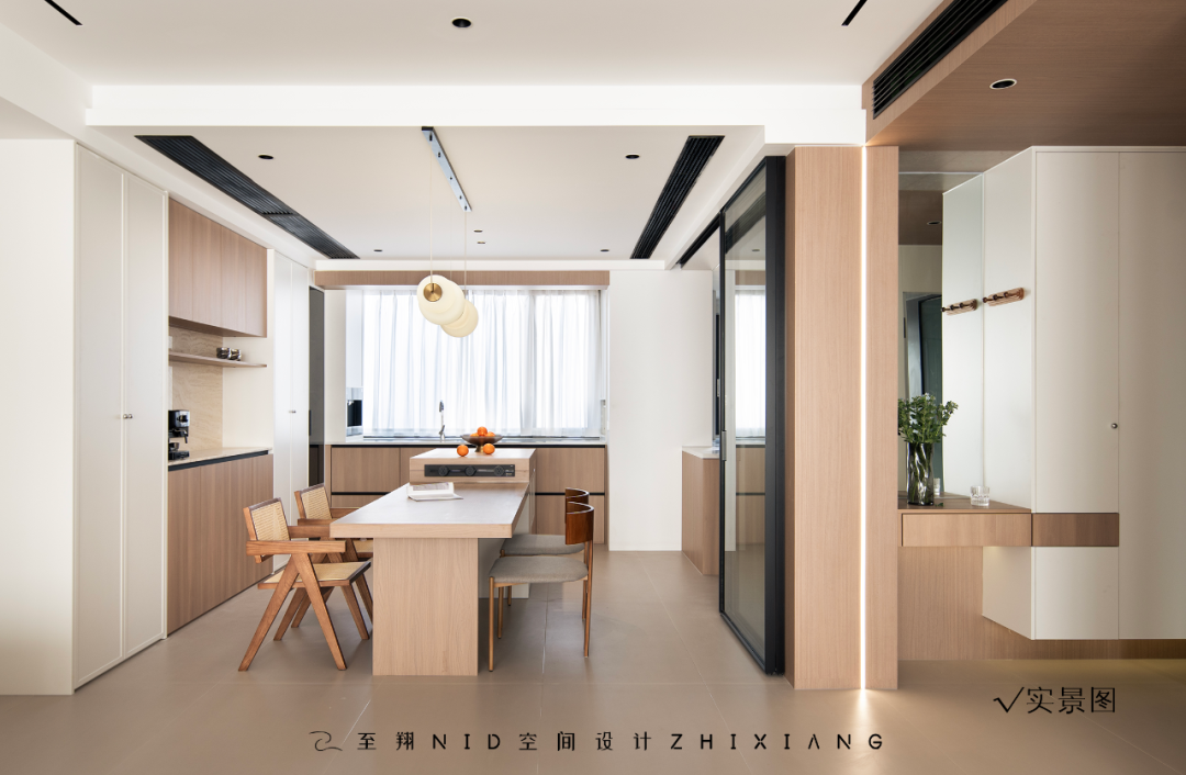
西厨与餐厅做了餐厨一体化,拉近了与客厅的距离,也使得整体空间贯通性。利用北阳台融入餐厅增大空间设计,增加西厨的操作台面,左侧一整排的收纳柜,餐边柜,完全满足6口之家的餐厅收纳。
The western kitchen and the dining room have made the kitchen integration, narrowing the distance with the living room, but also making the overall space connected.The north balcony is integrated into the restaurant to increase the space design, increase the operating table of the western kitchen, and a whole row of storage cabinets on the left side can fully meet the restaurant storage of a family of 6 people.
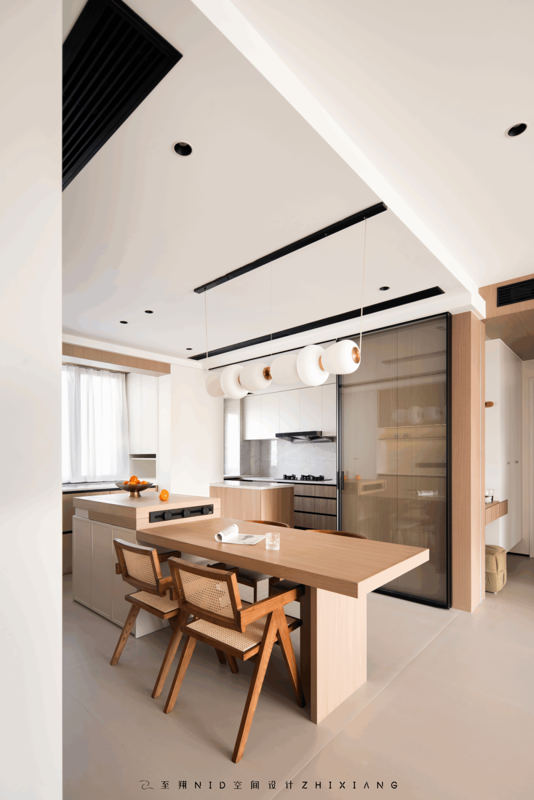
岛台餐桌一体化设计,结合了实木餐桌椅,将不同材质与感受相互碰撞,生活与自然纯朴之间的融合,给予一个家居空间更为丰富的互动感官体验。
The integrated design of the island table, combined with the solid wood dining table and chair, collides different materials and feelings, and integrates life and natural simplicity to give a home space a richer interactive sensory experience.
05.
Kitchen
Design agency: Zhi Xiang NID space design
厨房
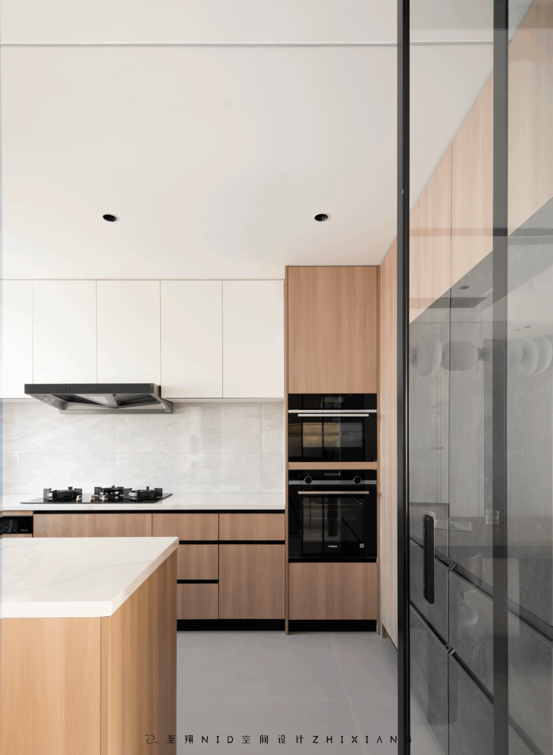
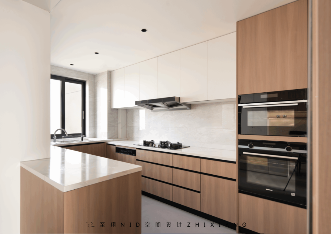
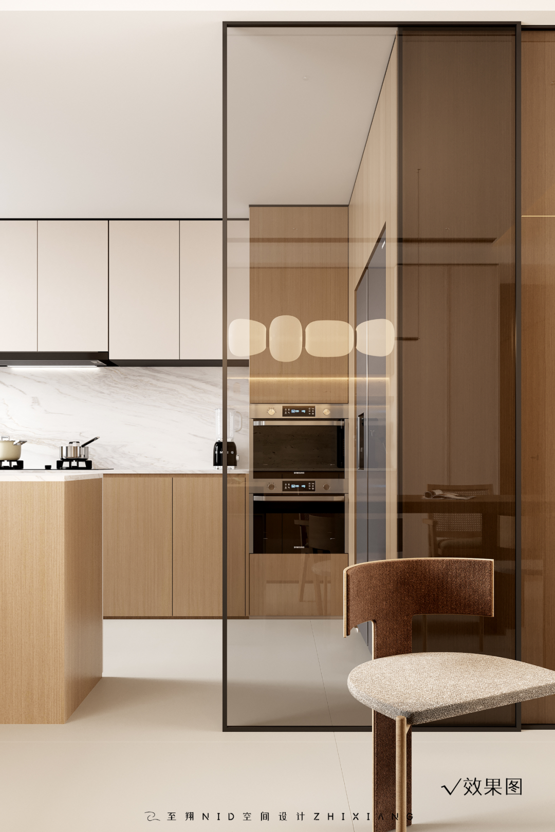
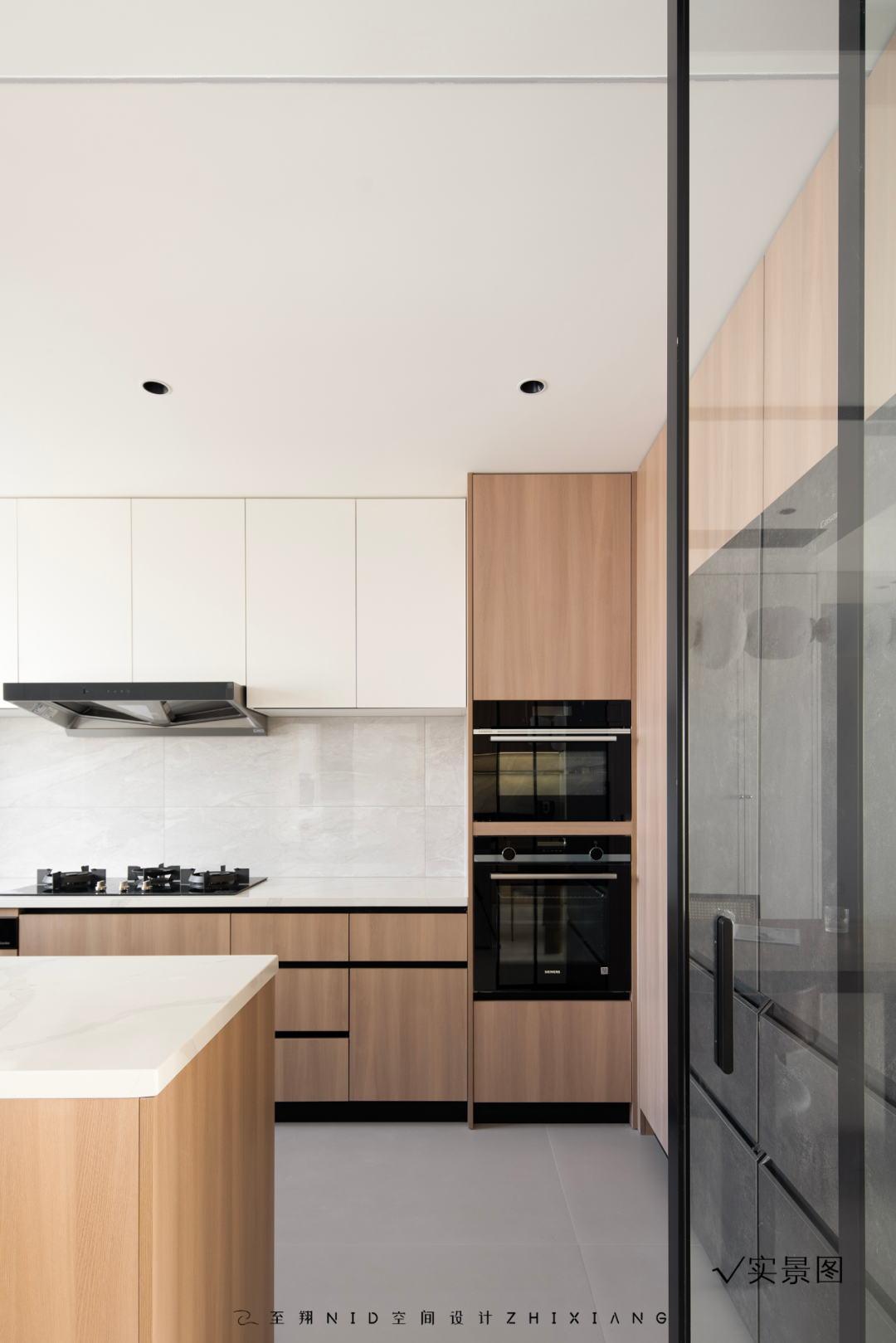
厨房半敞开式的设计,利用吊柜式玻璃移门,打开,整个厨房也打开,关闭中厨炒菜阻隔油烟,效果更明亮。
The semi-open design of the kitchen, the use of ceiling glass sliding door, open, the whole kitchen is also open, close the cooking in the kitchen to block the fume, the effect is brighter.
06.
Aisle
Design agency: Zhi Xiang NID space design
过道

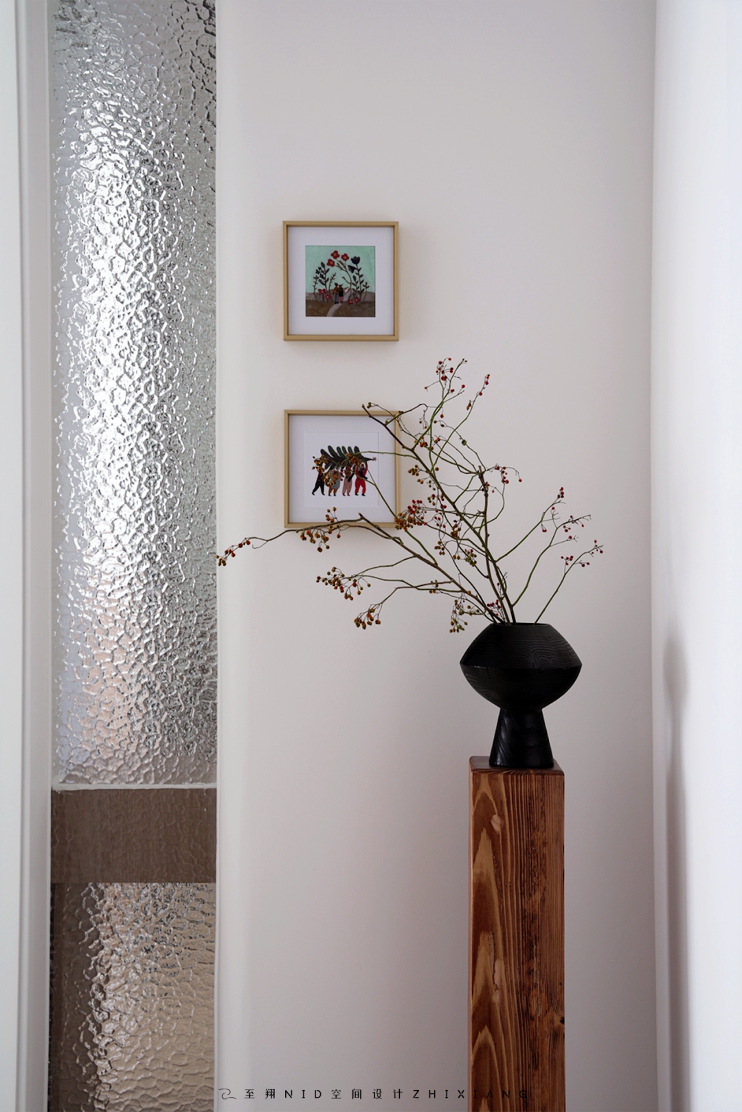
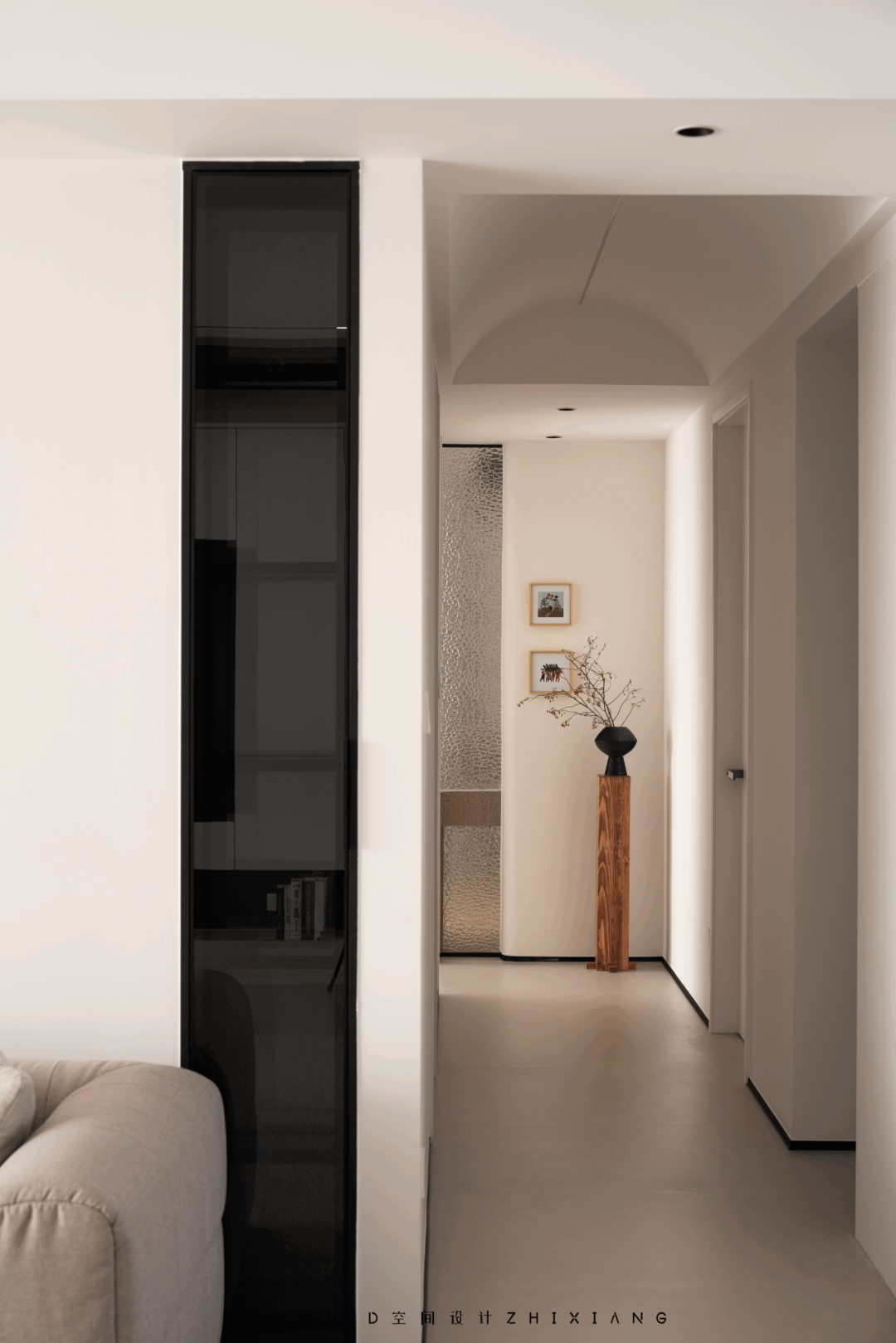
设计上扩大了过道尺寸,使得过道宽敞,吊顶拱形式古堡顶设计,仅用一根线性灯光贯穿整屋过道光线,又增加满满设计感。
原主卧改变格局后,避开入户门对房门的不好风水格局。走廊尽头增加玄关设计。打破外卫格局,设计干湿分离。运用油砂玻璃的透光感,增加室内光线,调整格局后增加双台盆,两个孩子再也不用争抢刷牙了。
In the design, the size of the aisle is expanded, making the aisle spacious, and the design of the ancient castle roof in the form of suspended ceiling arch, only a linear light runs through the whole hallway light, and increases the full design sense.
After changing the pattern of the original master bedroom, avoid the bad feng shui pattern of the entrance door to the door. Add a entrance design at the end of the corridor. Break the external pattern, design dry and wet separation. The use of oil sand glass light transmission, increase the indoor light, adjust the pattern after the addition of two basins, two children no longer have to fight to brush their teeth.
07.
Master bedroom
Design agency: Zhi Xiang NID space design
主卧室
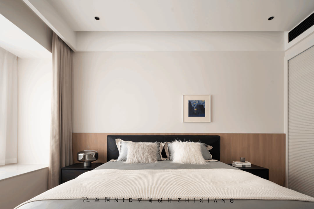
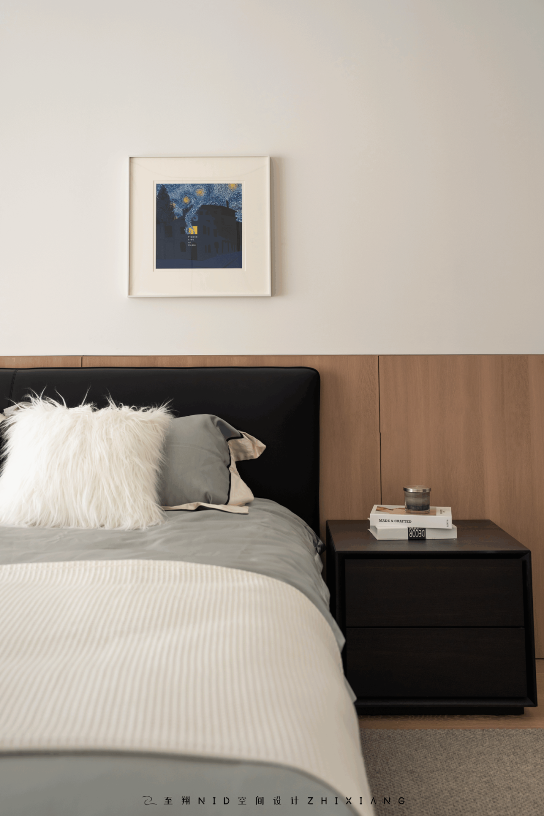
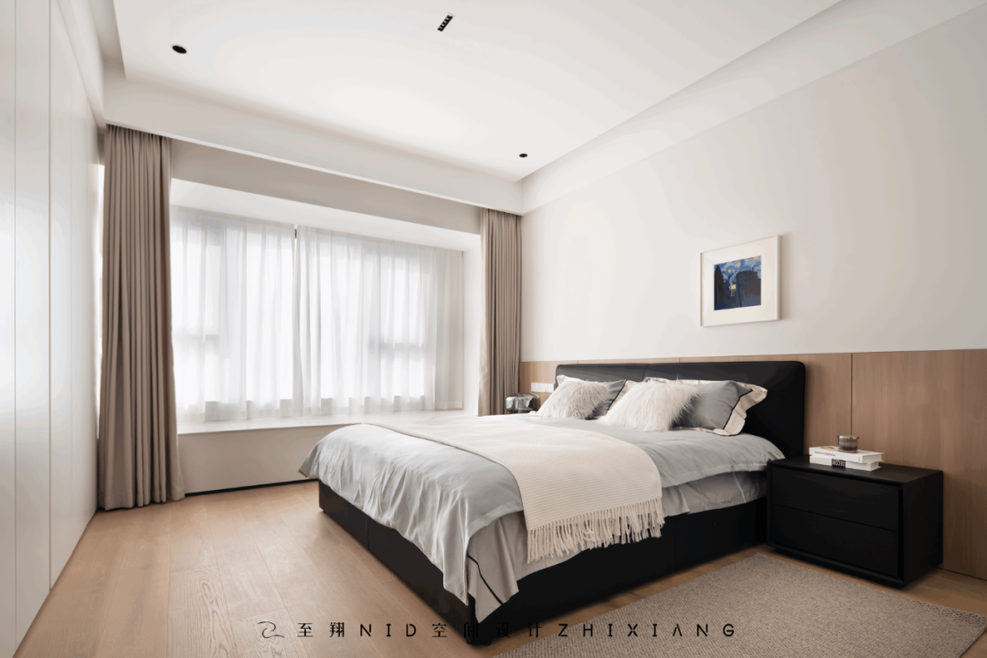
整屋奶白色色系,采用造型的结构连接,强调整个空间的整体感。床头木饰面,简洁质朴的原木设计,连接衣帽间,百叶移门增加层次感。床尾整排衣柜又增加收纳空间,不仅美观实用,更为浅色系为主的卧室植入一个焦点,提升了空间整体的美感。
The whole house has a milky white color, and the structural connection of the shape emphasizes the whole sense of the whole space. Headboard wood veneer, simple and rustic log design, connecting cloakroom, shutter sliding door to add layer. The whole row of wardrobes at the end of the bed increases the storage space, which is not only beautiful and practical, but also implants a focus in the light-colored bedroom, enhancing the overall beauty of the space.
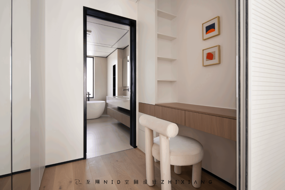
主卧增加储藏衣帽空间,独特梳妆台设计,一边收纳化妆品,一边连贯过道设计 半透明玻璃,增加整体设计感。
The master bedroom increases the storage space for clothes and hats, and has a unique dresser design. While storing cosmetics, translucent glass is designed to connect the aisle to increase the overall design sense.
08.
Master bathroom
Design agency: Zhi Xiang NID space design
主内卫
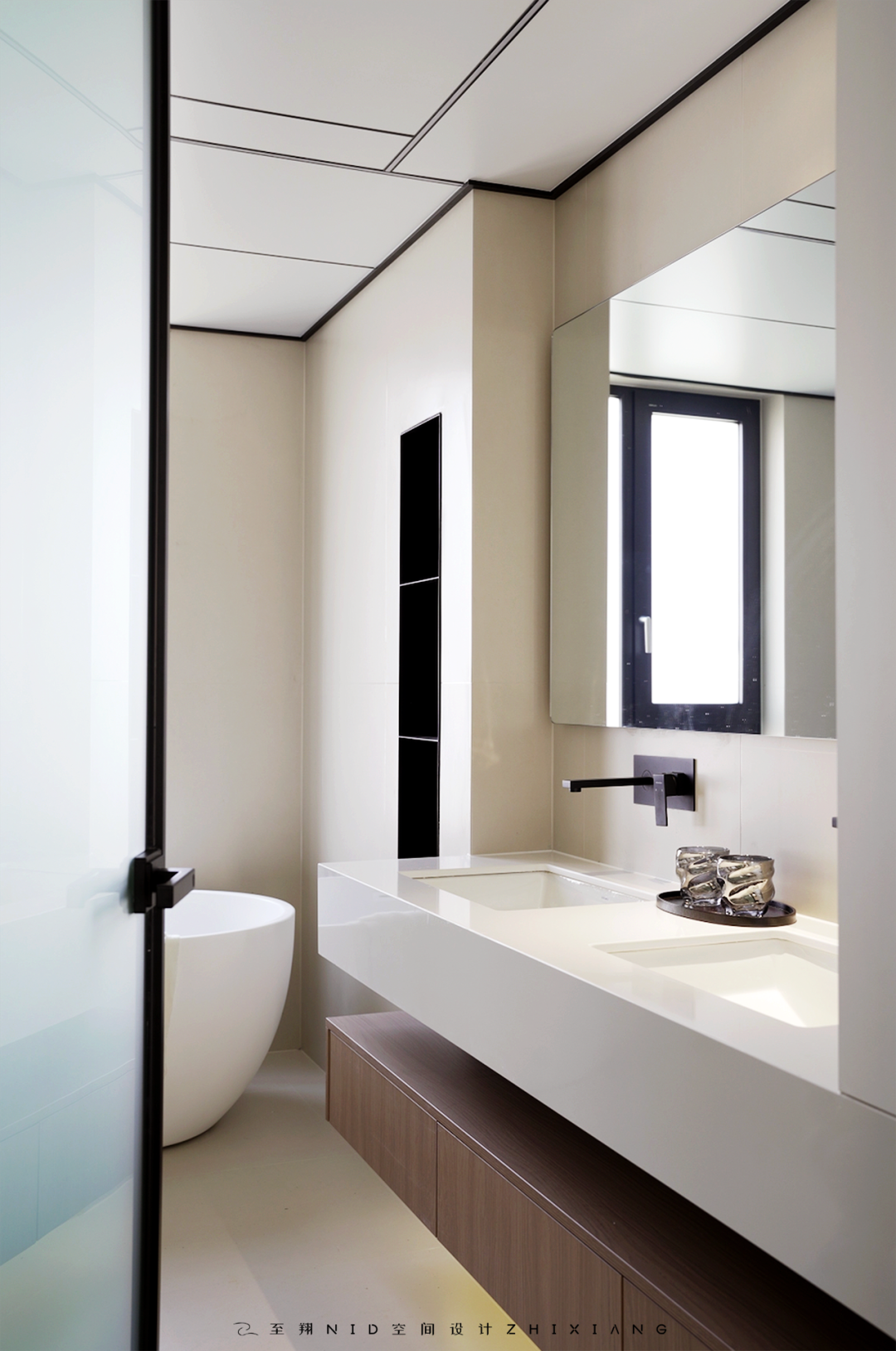
大板集成吊顶+筒灯组合,映射的奶油素色砖散发着自然的光泽,素色砖铺贴的墙面简洁又富有层次感。干湿分离方式,时刻保持干爽整洁的环境,四分离设计 双台盆 浴缸 智能马桶 独立淋浴空间,大大增加浴室满足感!
The large board integrates the suspended ceiling & downlight combination, the mapped cream plain brick exudes a natural luster, and the plain brick plastered wall is simple and rich in layers. Dry and wet separation method, always keep a dry and clean environment, four separate design double basin bathtub smart toilet independent shower space, greatly increase the bathroom satisfaction!
09.
Children's room
Design agency: Zhi Xiang NID space design
儿童房
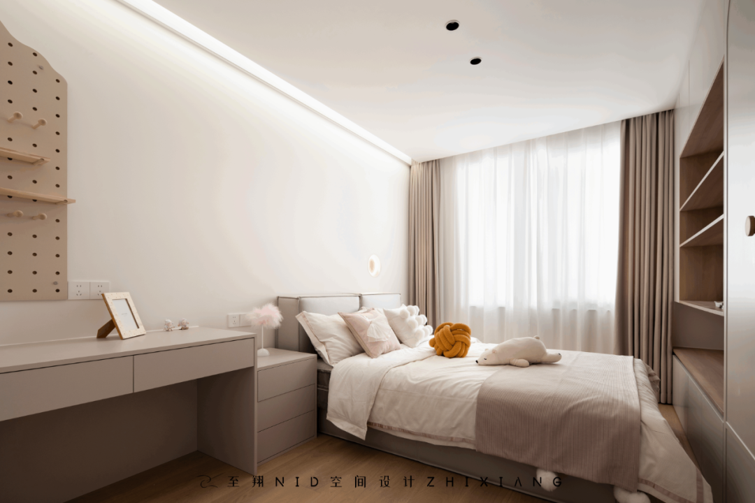
女儿房简单柔和的奶油色彩搭配更能让人静下心来,适合休息。床头嵌入式石膏壁灯设计与墙体形成呼应,让卧室空间更具简约的线条感。洞洞板和书桌处做了雾化玻璃设计,与客厅联动,即有互动性又有隐蔽性。
The simple and soft cream color of the daughter's room is more calming and suitable for rest. The bed head embedded plaster wall lamp design echoes the wall, making the bedroom space more simple line sense. The hole plate and the desk are designed with atomized glass, which is linked with the living room, which is interactive and hidden.
男孩房采用一并的简约设计,色彩搭配,软配的协调给空间带来温馨与惬意。
The boys' room adopts a simple design, color matching and soft coordination to bring warmth and comfort to the space.
实景效果图前后对比
-至翔NID空间设计-
标签:
热门资讯排行
- 资讯专区
- 图片专区
- 品牌专区


